4 Spring Color Palettes for Logo & Branding Inspiration
4 Spring Color Palettes for Logo & Branding Inspiration
This blog post is a must-read if you're looking for the best spring color palettes for logo and branding inspiration. Here, we'll reveal our favorite color palettes for logo design and tips on utilizing them to the fullest!
Whether you're just starting to establish your brand's visual identity or looking to refresh your company's logo and color palette, you've come to the right place. Here, we’re looking at some of the most popular spring color palettes for logos and branding inspiration, including True Spring, Warm Spring, Bright Spring, and Light Spring.
Spring is the season of renewal and life, symbolizing new beginnings. Its colors convey specific messages, such as warmth, lightness, brightness, and freshness - so if that’s what you want your logo to communicate to potential customers, stick with us!
Rest assured, the LogoMe team has plenty of experience designing beautiful logos that leave a lasting impression on shoppers, so you can be confident this guide will provide the inspiration you need to hit the ground running with your own logo design.
That’s enough preamble. Let’s explore some of our favorite Spring color palettes for logos and web design.
But before we do that, let's cover a few basics:
Why Refresh Your Brand and Why Spring Colors?
Refreshing your brand with Spring colors can invigorate customer interest, reflect current trends, and address evolving market needs, strengthening your market position.
Spring colors, characterized by their vibrant and fresh hues, evoke feelings of renewal, growth, and positivity. This makes them ideal for creating an engaging brand image that resonates with consumers who might be about to embark on their own "new beginning."
By reviving what you already have, you maintain your brand identity - that way, customers can continue to recognize your brand.
It indicates to customers that your brand is evolving, moving forward, and expanding.
Updating your brand can help it stay current with market trends and consumer preferences, ensuring it remains appealing to your target audience.
All that to say, a brand and logo refresh is a strategic move, not a complete rebrand. It’s a way to stay relevant and contemporary without a massive overhaul, so your audience will more readily adapt to the change. It's a win-win!
As for why Spring? Because Spring is the season of renewal and life. It’s also a representation of new beginnings. Its colors send a particular message. For example, warmth, lightness, brightness, and freshness.
The impact of spring colors could influence how prospective customers perceive your brand, thereby impacting customer engagement.
If that’s what you’re looking for for your logo and branding, keep reading.
Spring Color Palettes for Logo and Branding
There are four spring color palettes for logo design that we can't get enough of- True Spring, Warm Spring, Bright Spring, and Light Spring. Below, we’ll walk you through each of these to give you a sense of which colors are included in the palette how you can best use them to fuel your brand.
At this point, it's also worth noting that some colors are found in multiple palettes, so they'll be repeated.
With that said, let's get down to it:
True Spring Color Palettes
The True Spring palette features warm, bright, and light shades, creating a vibrant and inviting look. So, this could be perfect for your logo if you're after this vibe.
Shades in this palette include:
Cream
Biscotti
Hazelnut
Pink Geranium
Papaya
Buttercup
Island Green
Leaf
Aquamarine
Bluebird
Geranium
Flamingo Pink
Violet
Bright Blue
Bright Navy
Characteristics of True Spring Colors
Compared to the other palettes we're about to list, True Spring is at the warmer end of the spectrum, characterized by saturated, bright colors that are certainly not faded.
These colors have concentrated yellow undertones with no blue accents, even in this palette's shades of blue, such as bright blue and bright navy. This palette avoids super dark colors, offering darker shades of blue and red instead.
Design Tips
Color Blocking: Pair a bright color like Geranium or Island Green with a neutral tone like Cream for a balanced design. Using just one or two colors from the palette will help maintain a clean, uncluttered look.
Contrast: Use contrasting colors or different levels of light and dark to create dynamic and engaging logos.
Accent Colors: Use brighter shades like Buttercup or Pink Geranium as accent colors to highlight important elements of your design.
Playful Patterns: Leverage playful patterns like polka dots or stripes in colors like Aquamarine and Bluebird to add a fun, dynamic touch to your design.
Layering: Layer different shades of the same color (e.g., Buttercup and Papaya) to create a sense of depth and complexity.
Warm Spring Color Palettes
This palette is also sometimes referred to as Golden Spring. Here, you'll find the following colors:
Cream
Biscotti
Sunset Saffron
Cinnamon
Camel
Bright Apricot
Coral
Terracotta
Geranium*
Ganache
Buttercup*
Lime
Kerry Green
Aquamarine*
Bright Teal
* Also appear in True Spring
Characteristics of Warm Spring Color Palettes
Warm Spring colors are yellow-toned and on the warmer side. So, compared to other seasonal colors, it would fall closer to Autumn rather than Winter and Summer.
The colors here have a more tonal look than something super bold and bright, as seen in the True Spring palette.
The standout colors here are the warmer greens, yellows, pinks, orangey reds, and different shades of brown, from ganache to paler biscotti.
Design Tips
Warm Combinations: Use the warmer greens, yellows, pinks, orangey reds, and browns to create a harmonious and inviting logo.
Tonality: Focus on the tonal quality of the colors to achieve a cohesive and warm look.
Natural Inspirations: Incorporate natural elements such as floral patterns or leaf motifs that reflect the warm and earthy tones of the palette for a more organic and grounded design.
Contrast with Neutrals: Balance vibrant, warm colors with neutral tones like Cream or Biscotti to ensure the design isn't overwhelming and maintains a sophisticated appeal.
Seasonal Themes: Utilize the palette for seasonal designs, especially in the context of spring-themed promotions or events, to evoke a sense of renewal and warmth.
Bright Spring Color Palettes
Also referred to as Clear Spring or Blue Spring, Bright Spring colors say clarity and brilliance.
The colors found in this palette are:
Confetti
Strawberry
Poppy
Violet
Ultra Violet*
Soft White
Acid Yellow
Lemon Zest
Mint*
Island Green
Regatta Blue
Bright Navy*
Aquarius
Silver Marl
Dove Grey
* Also appears in the True Spring palette
Characteristics of Bright Spring Colors
The standout feature of Bright Spring colors is, yes, you guessed it, their brightness.
These colors are lighter and cooler, with the least yellow tones among the spring palettes listed here.
On the seasonal spectrum of color palettes, Bright Spring comes closer to Winter than the other seasons. The colors have a barely warm and light appearance.
Colors tend to look clear, with sharper, more acidic yellows. Lighter shades like gray and silver mix well with darker tones like ultraviolet and island green.
Design Tips
Sharp and Clear: Utilize clear, sharp colors for logos that need to stand out and convey brilliance.
Mix and Match: For a balanced design, combine lighter shades like gray and silver with darker tones like ultraviolet and island green.
Contrast and Balance: Ensure enough contrast between your logo's background and text colors to maintain readability.
Typography: Choose clean, modern fonts that complement the bright, clear nature of this color palette, ensuring your text stands out crisply against your chosen background colors.
Minimalism: Embrace minimalistic design principles, letting the bright colors speak for themselves without overcrowding the visual space.
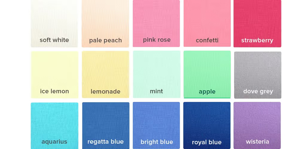
Light Spring Color Palettes
As its name suggests, the standout feel of this color palette is lightness. Light Spring is also sometimes referred to as Pastel Spring or Light Blue Spring, and the colors here are:
Soft White
Pale Peach
Pink Rose
Confetti **
Strawberry
Ice Lemon
Lemonade
Mint *
Apple
Dove Grey
Aquarius **
Regatta Blue **
Bright Blue
Royal Blue
Wisteria
* also appears in the True Spring palette
** also appears in the Bright Spring palette
Characteristics of Light Spring Colors
While Light Spring colors have some warmth through their yellowness, they also have softer and lighter shades of summer. In fact, Light Spring colors sit at the least warm end of the Spring palettes, making them closer to a smooth, light Summer palette.
A nice mix would be to use one of the brighter colors here, such as Royal Blue, with neutrals like Soft White, Pink Rose, and/or Confetti.
Design Tips
Soft and Light: Use light and soft colors to create a calming and delicate logo design.
Bright and Neutral Mix: Pair brighter colors like Royal Blue with neutrals like Soft White, Pink Rose, and Confetti for a balanced and elegant look.
Contrast with Pastels: For a sophisticated contrast, combine pastel tones like Pale Peach and Mint with darker accents like Regatta Blue.
Monochromatic Harmony: Achieve a balanced and reassuring monochromatic color scheme by varying the intensity of a single hue, such as different shades of Wisteria, to maintain harmony while adding visual interest.
Subtle Accents: Intrigue your audience by using brighter colors like Aquarius and Confetti to highlight specific elements of your logo, drawing attention without overwhelming the design.
Are You Ready to Breathe Some Life Into Your Logo With One of These Spring Color Palettes?
Refreshing your brand's logo and color palette with Spring's vibrant hues can bring new life into your business's visual identity.
Spring colors offer warmth, lightness, brightness, and freshness—qualities that resonate with renewal and new beginnings.
So, whether you choose the vibrant shades of True Spring, the deeper tones of Warm Spring, the clear hues of Bright Spring, or the delicate pastels of Light Spring, there's a palette to perfectly suit your branding needs.
Remember, a brand refresh isn't about a complete overhaul; it's a strategic update that keeps your brand relevant and appealing.
By incorporating these thoughtfully curated spring colors into your brand's aesthetic, you can ensure your logo and branding materials stay current, engaging, and reflective of your brand's evolution. So, embrace the season of revival and let these spring colors inspire your next branding project!
Rosie Greaves
Rosie Greaves is a professional content strategist specializing in all things digital marketing, B2B, and lifestyle. In addition to Spocket, you can find her published on Reader's Digest, E-commerce Platforms, and Judicious Inc.