How to Choose the Best Interesting Typeface & Fonts for Your Logo
How to Choose the Best Interesting Typeface & Fonts for Your Logo
Unlock the best expert tips and insights on choosing the best typeface and fonts for your logo. Learn how to select the perfect font to enhance your brand identity and make a lasting impression.
Choosing the right typeface and fonts for your logo isn't just about making it look good—it's about capturing the essence of your brand. The right font can tell your brand's story, enhance readability, and leave a lasting impression on your audience.
In this article, we'll dive into everything you need to know to pick the perfect fonts for your logo. From expert tips and key factors to consider, to common pitfalls to avoid, we've got you covered. Let's get started on finding the ideal font that will make your brand shine!
Understanding Typeface and Fonts
A typeface is a family of fonts that share common design features. Think of it as a collection of related fonts. For example, Helvetica is a typeface, and within the Helvetica typeface, you have different fonts like Helvetica Regular, Helvetica Bold, and Helvetica Italic.
A font, on the other hand, refers to a specific weight, style, and size within a typeface. So, Helvetica Bold at 12 points is a font.
Difference Between Typeface and Fonts
Understanding the difference between typeface and fonts can be a bit confusing, but here’s an analogy that might help: consider typeface as a music album and fonts as the individual songs on that album.
Just as each song contributes to the overall feel of the album, each font contributes to the typeface's overall design.
Importance of Fonts in Logo Design
Fonts are critical in logo design for several reasons:
Conveying Brand Personality: The font you choose for your logo can say a lot about your brand. For example, the Coca-Cola logo uses a script font that conveys a sense of tradition and nostalgia, aligning perfectly with its long history and heritage. On the other hand, tech companies like Google use sans-serif fonts in their logos to convey modernity and simplicity.
Improving Readability: A logo needs to be legible at various sizes and from different distances. Choosing the right font ensures that your logo is easily readable whether it's on a business card or a billboard. Take the Nike logo, for instance. Its clean and bold font is easily recognizable and readable in any context.
Creating a Lasting Impression: Your logo is often the first thing people see about your brand, and the font plays a big role in making that first impression. A well-chosen font can make your logo memorable. Consider the Disney logo—its unique, whimsical font is instantly recognizable and evokes a sense of magic and fantasy.
Key Factors to Consider When Choosing a Typeface for Your Logo
The right typeface can effectively communicate your brand's core values and ethos, making a lasting impression on your audience. Let’s explore some key factors for the same-
1. Brand Identity: How the Font Reflects Your Brand's Personality
The font you choose for your logo should resonate with your brand's identity and personality. Think of your font as a voice for your brand—it can be serious, playful, elegant, or bold. For instance, luxury brands like Tiffany & Co. use serif fonts to convey sophistication and elegance.
Their font choice reflects their high-end, timeless brand image. On the flip side, a fun and quirky brand like Ben & Jerry's uses a chunky, hand-drawn typeface that emphasizes their playful and creative personality.
2. Readability: Ensuring the Font is Legible at Different Sizes and in Various Contexts
A crucial factor in font selection is readability. Your logo should be easily readable whether it’s on a tiny business card or a large billboard. For example, consider the FedEx logo. Its simple, bold sans-serif font ensures that the company name is easily recognizable and readable at any size.
Additionally, the clever use of negative space to create an arrow between the "E" and the "x" enhances its visibility and memorability. Test your logo at various sizes to ensure it remains clear and legible in all contexts.
3. Versatility: The Font’s Adaptability Across Different Mediums (Print, Digital, etc.)
Your logo will appear across multiple platforms and formats, from websites and social media to print materials and merchandise. Therefore, the font needs to be versatile and adaptable. A great example is the Google logo, which uses a simple, modern sans-serif typeface.
This choice ensures the logo looks clean and consistent whether it's on a web browser, a mobile app, or printed on promotional materials. Choose a font that can maintain its integrity and appeal across different mediums.
4. Uniqueness: Selecting a Distinctive Font That Sets Your Brand Apart
In a crowded market, a unique font can help your logo stand out and make a memorable impression. Consider the distinctive handwritten style of the Instagram logo. This unique typeface sets it apart from other social media platforms and is instantly recognizable.
Similarly, the LEGO logo uses a bold, rounded font that is not only playful but also easily identifiable, reinforcing its brand as fun and creative.
When selecting a font, aim for something that captures the essence of your brand while ensuring it doesn’t blend in with generic or overused typefaces.
Types of Fonts and Their Impact on Brand Perception
Different types of fonts can evoke various emotions and perceptions, influencing how your brand is viewed by the audience.
Let’s explore the main types of fonts and their characteristics, best use cases, and some notable examples.
Serif Fonts
Serif fonts are characterized by small lines or strokes regularly attached to the ends of larger strokes in a letter or symbol. They are often seen as traditional, reliable, and formal. Brands that want to convey a sense of heritage and trust often use serif fonts.
Use Cases:
Times New Roman: Frequently used in newspapers and books, this font suggests reliability and tradition.
Tiffany & Co.: Their logo uses a serif font that exudes elegance and sophistication, reinforcing their brand as a luxury jeweler.
Sans-serif fonts, as the name suggests, lack the small lines at the ends of letters. They are typically seen as modern, clean, and straightforward. These fonts are excellent for digital use due to their simplicity and readability on screens.
Use Cases:
Helvetica: Used by brands like Jeep and Panasonic, it conveys clarity and neutrality.
Google: Their logo features a sans-serif font, emphasizing simplicity and modernity.
Sans-serif fonts are ideal for tech companies, startups, and brands aiming for a modern, approachable image.
Script Fonts
Script fonts mimic the fluid strokes of handwriting and are often perceived as elegant, personal, and creative. They can range from formal calligraphy to casual, playful styles.
Use Cases:
Coca-Cola: Their iconic logo uses a flowing script font, conveying a sense of tradition and friendliness.
Instagram: Their previous logo used a casual script font, which gave the brand a friendly and approachable feel.
Script fonts are perfect for brands in creative industries, such as fashion, beauty, and personal services, where a touch of elegance or personality is desired.
Display Fonts
Display fonts are designed to make a strong impact and are often more decorative and expressive. They are used in headlines, logos, and advertising to grab attention.
Use Cases:
LEGO: Their logo uses a bold, playful display font, which is perfect for a brand focused on fun and creativity.
Disney: The whimsical, fantasy-inspired font in their logo captures the magic and imagination associated with the brand.
Display fonts are best used sparingly, typically in logos and headlines, to make a bold statement without overwhelming the overall design.
Expert Tips for Choosing the Right Font
Choosing the right font for your logo involves more than just picking one that looks good. It requires a strategic approach to ensure the font aligns with your brand's message, works well in various contexts, and remains timeless. Here are some expert tips to guide you.
Align Font Style with Brand Message
The font style you choose should reflect your brand's core message and personality. Think of the font as the voice of your brand—how do you want it to sound? For example, a law firm might choose a traditional serif font like Garamond to convey professionalism and trustworthiness, while a modern tech startup might opt for a sleek sans-serif font like Arial to express innovation and simplicity.
For example,The FedEx logo uses a clean, bold sans-serif font that aligns with its brand message of speed and reliability. The hidden arrow between the "E" and the "x" subtly reinforces their commitment to efficient delivery.
Consider Font Pairing for Complex Logos
Sometimes, a logo may require more than one font to convey different aspects of the brand. Effective font pairing can create visual hierarchy and balance. The key is to choose fonts that complement each other without clashing.
Such as in the New York Times logo, the combination of the gothic serif for "The New York Times" and a clean, sans-serif font for sections like "Opinion" creates a balanced and readable design, emphasizing both tradition and modernity.
When pairing fonts, consider using one font for the primary brand name and another for secondary elements like taglines or slogans. This helps create distinction and focus.
Test Fonts in Different Contexts
A font may look great on a computer screen but not as effective in other contexts. It's crucial to test your chosen fonts in various scenarios to ensure they maintain readability and appeal.
The Nike logo maintains its strong visual impact whether it’s on a small product label or a massive billboard. Testing their iconic, bold typeface in different sizes and environments ensured its consistent performance.
To test effectively, print your logo, view it on different devices, and see how it looks in both small and large formats. This will help you catch any potential issues with readability or scalability.
Avoid Overly Trendy Fonts
While trendy fonts can make your logo look contemporary, they also run the risk of becoming outdated quickly. A timeless font choice ensures your logo remains relevant and effective for years to come.
A very good example of this isthe Coca-Cola logo. It has used the same script font since its creation in 1886. Despite changing design trends, the font’s timeless elegance has kept the logo iconic and relevant.
When choosing a font, consider its longevity. Will it still look good in five or ten years? Opt for classic styles that have stood the test of time over overly trendy fonts that may fade in popularity.
Case Studies of Successful Logo Fonts
Examining successful logo fonts from well-known brands can provide valuable insights into why certain fonts work and how they can be applied to your own logo design. Let’s dive into some detailed examples and analyze the reasons behind their font choices.
Examples of Well-Known Brands and Their Fonts
Netflix The Netflix logo uses a custom sans-serif font that is bold and modern, with clean lines and simple design. This font choice conveys a sense of reliability and cutting-edge entertainment, aligning with Netflix's identity as a leading streaming service.
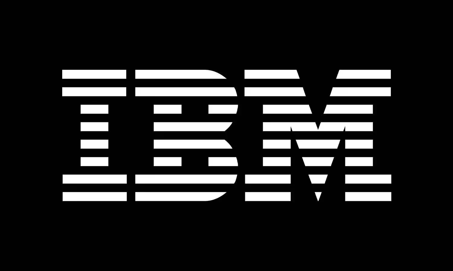
IBM IBM’s logo uses a slab-serif font known as City Medium, designed by Paul Rand. The font is bold, stable, and highly readable, conveying professionalism, strength, and dependability, which are core attributes of IBM's brand.
LEGO The LEGO logo features a custom, playful, and rounded font that looks approachable and fun. This font choice reflects the brand’s focus on creativity, play, and imagination, appealing to both children and adults.
Google Google’s current logo uses a custom sans-serif typeface called Product Sans. The font is simple, clean, and modern, with a playful touch that reflects Google’s brand values of accessibility, innovation, and friendliness.
Analysis of Why These Fonts Work
Netflix: The bold, sans-serif font in the Netflix logo is modern and straightforward, making it easily recognizable and readable across different platforms. The simplicity of the font emphasizes the ease of use and accessibility of Netflix's streaming service.
IBM: The slab-serif font used in the IBM logo conveys strength and stability, which are essential qualities for a technology and consulting company. The uniformity and boldness of the font make it stand out and easy to read, reinforcing IBM’s reputation for reliability.
LEGO: The rounded, custom font of the LEGO logo is fun and playful, perfectly capturing the essence of the brand. This font choice makes the logo friendly and inviting, appealing to the brand’s target audience of children and creative individuals.
Google: Google’s use of a clean, sans-serif font reflects its commitment to simplicity and user-friendliness. The font's playful elements, such as the rounded letters, add a touch of creativity and approachability, aligning with Google’s innovative and accessible brand image.
Lessons to Learn from These Examples
Consistency with Brand Identity: Choose a font that reflects your brand's core values and personality. Netflix’s bold, modern font underscores its position as a leader in entertainment, while LEGO’s playful font highlights creativity and fun.
Adaptability: Ensure your font can be easily adapted across different mediums and contexts. Google’s Product Sans works well on digital screens of all sizes, maintaining clarity and readability.
Readability and Distinctiveness: Prioritize readability and select a font that stands out. IBM’s slab-serif font is highly readable and distinctive, reinforcing its brand strength and stability.
Emotional Connection: Select a font that creates an emotional connection with your audience. LEGO’s friendly, rounded font appeals to the playful and imaginative nature of its users.
Tools and Resources for Selecting Fonts
Choosing the right font for your logo can be a daunting task, but thankfully, there are numerous tools and resources available to help you make an informed decision. These tools can assist with font selection, pairing, and even offer libraries of high-quality fonts to choose from. Let’s explore some of the best options out there.
There are several online tools designed to help you find and pair fonts effectively. These tools can save you time and ensure that your fonts work well together.
Google Fonts Google Fonts is a free resource that offers a vast library of open-source fonts. It allows you to preview and pair different fonts to see how they look together in real time. This tool is particularly useful for ensuring readability and compatibility across various digital platforms.
Font Pair Font Pair is an excellent tool for finding font combinations that work well together. It provides curated font pairings, making it easier to match a primary font with a complementary secondary font. This is especially useful for creating a cohesive and balanced logo.
Typekit (Adobe Fonts) Adobe Fonts, formerly known as Typekit, offers a premium selection of high-quality fonts. It integrates seamlessly with Adobe Creative Cloud, allowing you to test and use fonts directly within design software like Photoshop and Illustrator. This tool is ideal for professional designers looking for a wide range of typefaces.
Fontjoy Fontjoy uses machine learning to help you find the perfect font combinations. You can generate random pairings or adjust the settings to find pairings that are more harmonious or more contrasting, depending on your design needs. This tool is great for experimenting with different styles and seeing what works best for your brand.
Font Libraries and Marketplaces
Finding the right font often means exploring various libraries and marketplaces where you can browse and purchase high-quality typefaces.
MyFonts MyFonts is one of the largest font libraries available, offering thousands of fonts from various foundries and designers. It includes both free and paid options, and you can filter by style, popularity, and price to find the perfect font for your logo.
FontShop FontShop provides a wide range of professional fonts, with options for individual purchases or subscription plans. It offers detailed previews and sample texts, allowing you to see how the fonts will look in different contexts before making a decision.
Creative Market Creative Market is a marketplace for independent designers, offering unique and creative fonts that you might not find elsewhere. It’s a great place to discover distinctive typefaces that can help your logo stand out from the competition.
Fonts.com Fonts.com offers an extensive collection of fonts, including many from well-known type foundries. It provides both web and desktop font options, ensuring you can find a font that meets your specific needs. The site also offers font pairing suggestions and other helpful resources.
Common Mistakes to Avoid
When it comes to choosing fonts for your logo, certain pitfalls can undermine your design and brand message. Avoiding these common mistakes will help ensure your logo is effective and professional.
Using Too Many Fonts
Using multiple fonts in a logo can lead to a cluttered and confusing design. Simplicity is key in logo design, as it ensures clarity and helps create a strong, memorable brand image.
Consider the logos of brands like Nike and Apple. Both use a single, clean font that is easily recognizable and straightforward. This simplicity enhances their logos' impact and ensures they are easily identifiable across various mediums.
Tip: Stick to one or two fonts. If you need variety, use different weights or styles (e.g., bold or italic) of the same font family to maintain consistency while adding visual interest.
Choosing Fonts That Are Hard to Read
Readability is a crucial factor in logo design. If people can't easily read your logo, it fails to communicate your brand effectively. Fonts that are overly decorative or intricate may look appealing but can hinder readability.
The Zara logo initially used a highly stylized serif font that some found difficult to read. In 2019, they updated their logo to a simpler serif font, improving readability while maintaining a sophisticated look.
Tip: Test your logo in different sizes and formats to ensure it remains legible. Avoid overly complex fonts and opt for ones that are clear and straightforward, even at smaller sizes.
Ignoring the Importance of Scalability
A scalable logo ensures that it looks good at any size, from a tiny business card to a large billboard. Fonts that don’t scale well can lose their clarity and impact, making your logo less effective.
Example: The Chanel logo uses a simple, bold sans-serif font that looks equally impressive on a small perfume bottle or a large store sign. Its scalability ensures the logo remains clear and impactful regardless of size.
Tip: Design your logo with scalability in mind. Test it at various sizes to ensure it retains its clarity and visual appeal. Choose fonts that are versatile and maintain their integrity across different formats and mediums.
Conclusion
Choosing the right typeface and fonts for your logo is essential for creating a strong, memorable brand identity. We’ve explored how aligning font style with your brand message can significantly impact your logo’s success. The right font can convey your brand’s personality, enhance readability, and create a lasting impression.
Before settling on a font, don’t hesitate to experiment with different options and test them in various contexts. This process will help you identify the best font that remains readable, scalable, and perfectly aligned with your brand identity.
Take your time to refine your choices to create a logo that truly represents your brand’s essence. And when you’re ready to create a stunning logo that captures your brand's essence, visit Logome to start designing with our powerful AI logo generator and expert design tools.
Bring your brand to life with the perfect logo today!
The Logome Team
The LogoMe team is a passionate group of design enthusiasts and branding experts dedicated to helping businesses create stunning visual identities and logos. Through our insightful blog, we share the latest trends, tips, and best practices in logo design, branding strategies, digital marketing, etc. to inspire and empower you.