Evolution of Cadillac Logo: A Journey Through History and Innovation
Cadillac Logo Evolution: Explore the history of Cadillac's iconic logos, from ornate crests to modern symbols of luxury and innovation. Discover the brand's journey and milestones.

Cadillac Logo Evolution: Explore the history of Cadillac's iconic logos, from ornate crests to modern symbols of luxury and innovation. Discover the brand's journey and milestones.

.avif)
The Cadillac logo evolution is a fascinating journey through the history of one of America's most iconic automotive brands. From its inception in 1902, the Cadillac emblem has undergone numerous transformations, each reflecting the brand's commitment to innovation, luxury, and design excellence. Over the years, the logo has evolved from an ornate crest inspired by the founder's coat of arms to a sleek, modern symbol of sophistication and cutting-edge technology. This blog explores each iteration of the Cadillac logo, highlighting the significant changes, interesting facts, and the historical context behind each redesign. Discover how Cadillac's visual identity has adapted to changing trends while maintaining its prestigious image in the automotive industry.
Cadillac is a renowned American automobile manufacturer known for producing luxury vehicles. Founded in 1902, Cadillac quickly established itself as a leader in automotive innovation and quality. The brand is named after Antoine Laumet de La Mothe, sieur de Cadillac, the French explorer and founder of Detroit, symbolizing a rich heritage and connection to its origins.
Cadillac's commitment to excellence is evident in its long history of pioneering advancements in the automotive industry. It was the first car manufacturer to mass-produce vehicles with interchangeable parts, setting a new standard for quality and reliability. Cadillac introduced the first V8 engine, the first fully enclosed car, and numerous other innovations that have shaped the industry.
The brand's focus on luxury and performance has made Cadillac a symbol of American success and prestige. Over the decades, Cadillac has evolved its design philosophy to stay at the forefront of automotive fashion and technology, appealing to both traditional luxury buyers and a new generation of car enthusiasts. Today, Cadillac continues to push the boundaries with cutting-edge features, advanced safety systems, and a growing lineup of electric vehicles, maintaining its reputation as the "Standard of the World" in the luxury car market.

The first Cadillac logo was designed in 1902 and featured a crest with swans and parallel lines, with a crown on top and an ornate circle framing. The crest was inspired by the Detroit founder’s coat of arms. The wordmark “La Mothe Cadillac” was placed on the bottom part of the logo. The trademark was registered in 1906.
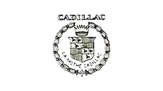
The Cadillac logo from 1905 was based on the previous crest version but was stylized and redrawn in circular shapes. It was a lighter version of the black crest with ducks and checkers, enclosed in a thin rounded frame with a stylized crown on top and floral ornaments on the sides. The whole composition was placed on a bigger white circle with an interesting black framing.

The redesign of 1906 brought back the original composition, refining the contours of all elements and cleaning up the background of the logo. The crest got enlarged, so all the small elements on it became more visible. The lettering, arched at the bottom of the logo, was set in a medium-weight sans-serif typeface with modern contours of the characters.

In 1908 the Cadillac logo became more graphical and bold. The frame now featured clean lines, the nameplate gained a thicker typeface, and it was placed on the top of the emblem, right above the crown. The tagline “Standard of The World” was added to the bottom.

The logo from 1908 was slightly changed in 1914. The “Cadillac” lettering was replaced by a massive and elegant crown image, and the additional arched lettering from the bottom of the badge was replaced by a sophisticated leaf wreath. The circular medallion was placed between two wing-like elements, composed of elongated leaves in different shapes.

In 1915 the American brand brought back the badge created in 1908, with the iconic crest surrounded by strong and bold black lettering in a classy serif typeface. The uppercase “Cadillac” was slightly enlarged and arched above the crest, and the “Standard of the World” featured smaller letters and was arched from the center along the bottom border of the medallion.

The lettering was removed from the Cadillac logo in 1920. The ornate tulip ring from the first brand’s emblem was added, and the crown was changed a little. Now it featured seven points. The crest itself remained almost untouched, just slightly refined.

The badge introduced by the company in 1925 stayed with Cadillac for less than a year. It was an experimental design, with the circular medallion placed on a solid octagon. The logo was accompanied by the “Cadillac” lettering on top and the “Standard of the World” at the bottom.

The circular shape left the Cadillac visual identity concept in 1926, with the crest being placed on a larger crest with elongated lines and sharp corners. The new badge looked sleek and powerful and stayed with the brand for four years.

The redesign of 1930 changed the shape of the Cadillac badge again. This time the main crest was enlarged and placed on a transparent background without any additional framing. It was slightly extended and had its upper border straight, while the bottom was rounded at the sides and sharpened in the middle.

In 1932 the company introduced an experimental version of the badge, where the small crest was placed between two stylized extended wings, against a solid black background of a circular medallion with a thick silver frame. This version of the badge was used by Cadillac for only several months.

The redesign of 1933 introduced a modern and sharp Cadillac badge. The legendary crest was redrawn in darker shades and placed between two stylized elongated wings, executed in wide and sharpened lines and spread far to the sides. The wings were drawn in white with thin black lines as accents. The seven small elements were placed in the upper line of the crest, symbolizing the crown.

Another interesting geometric version of the Cadillac logo was created by the designers in 1939. This time the iconic coat of arms was set on the upper part of a sharp and narrow triangle, which had its peak elongated and pointing down. The triangle featured a geometric monochrome pattern, composed of several rectangles, set in numerous rows, separated by thick white horizontal lines. The crown on this version of the badge was more traditional — its rounded contour was set right above the crest.

The Cadillac logo from 1942 is an amazing example of the Art-Deco style in logo design. The crest was placed on a wider one, with smooth sides and a pointed bottom. Two stylized white wings were spread up from the bigger gray crest, forming an interesting elongated top shape, resembling a feathery crown. It was something completely new not only for the brand but for the whole world. This logo only stayed with Cadillac for five years.

The Cadillac logo underwent some major changes in 1947. It now featured sharp angles and straight lines of the V-shaped symbol, placed underneath the crest.

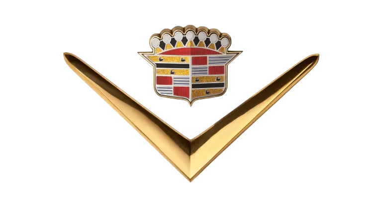
The logo introduced in 1949 was executed in a gold, red, white, and black color palette, and featured a combination of a sharp bold tick, extended horizontally, placed under the enlarged Cadillac crest.
The redesign of 1952 made both elements of the Cadillac badge smaller and placed them on a plain white medallion with a thin circular outline. The badge was also accompanied by the “Golden Anniversary” lettering and the datemark, written on the sides of the crest.

The Cadillac badge was redesigned again in 1953, with the enlarged golden crest placed directly on a white background without any accompaniments. Despite the simplicity of the concept, this was a very powerful crest, representing the brand at its best.

In 1957 the V-logo was modified. It became wider and gained a more luxurious style due to the modification of the crest. The crown was completely changed, as well as the images of the coat of arms. The swans are not readable anymore. The shield’s frame became bolder and sleeker.

The redesign of 1960 introduced a completely new badge, with the crest merged with the tick. It was a silver emblem, with the sharp V-shaped element drawn as the top part of the iconic Cadillac crest, with its bars elongated and sharpened. The body of the crest was horizontally stretched.

The most famous Cadillac emblem was created in 1963 and stayed with the brand for more than 40 years. It was composed of a colorful crest with a silver wreath framing. The crest featured yellow, fuchsia, and blue colors with white and black details, which made the logo look creative and modern.

In 1964 the company came back to the design concept from 1953, but the crest here was executed in silver with all the elements in one color, engraved on the surface of the shield. This badge was very minimalistic and looked super stylish.

The logo created for Cadillac in 1965 brought back the tick, and this time it was thinner and looked sharper, with the bars executed in gold and silver, and the small elegant crest executed in the same palette, with the addition of red and white.

The redesign of 1971 placed the silver Cadillac crest under a vertically extended geometric element, which looked like stylized wings pointing straight up, forming a triangular top border. This badge stayed in use by the company for almost ten years and was something new, not typical for the brand.

In 1980 the Cadillac badge got a new redesign, with gold, red, and black colors added to the surface of an enlarged silver crest, which was placed against a plain transparent background and enclosed into a circular frame, drawn as a leafy wreath with its contour open on top. It was a sleek and elegant version of the badge, which stayed untouched for another five years.

The redesign of 1985 brought back the golden color palette, with all the silver shades replaced. As for the geometry and concept of the logo, it remained almost unchanged. But in warm and shiny gold, all elements started looking more delicate and luxurious.

In 1995 the company drew the emblem with two-dimensional lines above a large cursive “Cadillac” lettering executed in a smooth custom typeface, with rounded title case characters written in a calm yet deep shade of blue. This design emphasized elegance and sophistication.

The logo was refined, and the color palette was slightly changed to more traditional tones. The Cadillac logo from the 2000s is modern and sophisticated, reflecting the brand’s high-end segment and confidence. The design included a sleek crest with colorful sections in red, gold, and black, and a refined silver wreath.

The Cadillac badge used in the early 2010s was similar to the previous version, but with refined contours and modifications. The darker shades and more distinctive lines inside the crest, as well as in its outline and the wreath, were used as framing. This version emphasized the brand’s attention to detail and modern design.

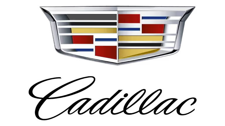
In 2014 the company removed the wreath from its logo. Now the Cadillac visual identity was composed of a modernized crest with an elegant cursive wordmark underneath it. The smooth, sophisticated lines of the lettering perfectly balanced the sharp and brutal shape of the crest. This logo symbolized a blend of tradition and modernity.
The redesign of 2021 removed the cursive wordmark from the primary badge and switched the color palette of the crest to black-and-white, making the Cadillac logo extremely minimalistic and powerful. The new logo is sharp and brutal, evoking a sense of professionalism and excellence.

Each iteration of the Cadillac logo has reflected changes in design trends and the company’s brand identity, from ornate and detailed crests to minimalist and modern designs. The evolution of the logo highlights Cadillac’s balance between heritage and contemporary aesthetics, maintaining its status as a symbol of luxury and innovation in the automotive industry.


Discover how 500,000+ businesses and creators are using our AI logo maker in their Logo creation.


