History of The Nickelodeon Logo
Discover the Nickelodeon logo story. See how this playful symbol charmed viewers, shaped the channel, and has remained a fun marker for kids’ programming since 1979.

Discover the Nickelodeon logo story. See how this playful symbol charmed viewers, shaped the channel, and has remained a fun marker for kids’ programming since 1979.


The Nickelodeon logo triggers nostalgia and excitement. It has lit up screens since the late 1970s, sparking laughs and memories.
People of all ages see it and recall quirky slime, cartoon heroes, and creative shows. It’s a fun portal to simpler times. Fans crave the story behind that bright orange shape. They want to connect the symbol to its heritage.

Picture the playful text, the bright color, and the energy it radiates. It signals fun, shapes pop culture references, and welcomes viewers into a world of kid-friendly joy. That orange lettering goes beyond simple branding. It tells a story of whimsy, exploration, and imagination across generations. Learn how one logo helped Nickelodeon stand out, why it still matters, and how its design journey began.
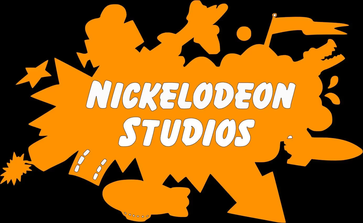
The Nickelodeon logo is a bright, orange wordmark representing one of the biggest kids’ entertainment brands. Its playful shape and color connect with viewers of all ages. The channel started in 1979, and the logo soon became a sign of fun shows, silly slime moments, and kid-focused content. Through every transformation, the Nickelodeon logo has stuck to its core message—bright, happy, and full of life.
This logo is more than simple text. It reflects the energy of cartoons, live-action series, and interactive games. Early versions included a man peering through a device, but the design shifted to modern, orange lettering over time. Children and parents spot it instantly. They recall iconic characters, green slime events, and uplifting theme songs.
Today, the Nickelodeon logo remains a beacon of childhood joy. Its color palette stands out on TV screens, apps, merchandise, and event stages. When people see it, they think of laughter, original shows, and a place where kids can be themselves. It’s that powerful. This design has a long story and continues to surprise fans who recognize it as a friendly face in children’s entertainment. It captures childlike wonder and celebrates youthful imagination worldwide.
Several creative minds shaped the Nickelodeon logo over the years. The earliest official design, introduced in 1979, featured a black-and-white emblem. It included a man looking through a theatrical viewer, representing the channel’s educational programming origins. The name “Nickelodeon” was displayed in a classic, serif-style font, reflecting a more traditional look.
In the 1980s, designers experimented with bolder colors, more oversized lettering, and whimsical shapes. One key contributor was Lou Dorfsman, who created a memorable pinball-like version. Different artists joined forces with network executives to refine their identities. Each redesign reflected a fresh take on children’s entertainment trends.
The most recognizable orange wordmark, which fans know today, took shape in 2009. Designer Eric Zim introduced the current lowercase style. He aimed to capture a friendly tone for younger audiences and keep the bright energy Nickelodeon stood for. The color scheme remained orange, providing continuity with previous logos.
Although many designers worked on the Nickelodeon logo, each brought a unique approach. Some designs included unexpected shapes like splashes or quirky fonts. Others stayed minimal. The consistent factor was the desire to keep it child-friendly, approachable, and instantly identifiable. Every iteration tried to strike a balance between fun.
The Nickelodeon logo is more than an orange wordmark. It symbolizes youthful creativity. That bright hue brings to mind energy, laughter, and endless imagination. The channel targets children, so the color choice feels warm and inviting. Parents notice it, too, recalling childhood memories tied to cartoons and wild slime shows.
The symbol's earliest form included a silhouette of a gentleman gazing through a lens, which hinted at motion pictures, curiosity, and the origins of early Nickelodeon. Later designs embraced quirky shapes like splatters, fonts, or pinball imagery. Each design connected with children’s sense of wonder and discovery.
Today, the primary symbol is an orange lowercase wordmark placed on white backgrounds for contrast. This choice exudes simple joy. It’s direct, approachable, and easy to read, matching the brand’s focus on fun. The emphasis is on the name itself, reflecting Nickelodeon’s position as a champion of kids’ programming.
No matter the version, the Nickelodeon logo represents an inclusive space where kids can laugh, learn, and explore. That visual identity fosters familiarity and trust. People see the orange and think of jokes, high-energy hosts, silly pranks, and a place where imagination rules. Always.
Nickelodeon stands out for its child-centered shows, zany humor, and iconic Nickelodeon logo. Kids see the orange splash and anticipate lively programming. The channel has launched countless memorable cartoons, including “SpongeBob SquarePants” and “Rugrats.” Older viewers remember the green slime, high-energy game shows, and unexpected challenges on classic series like “Double Dare.”
The brand’s success comes from understanding what kids love. Quirky animation, comedic sketches, and live-action sitcoms fueled its popularity. It was one of the first networks devoted entirely to children’s content. That focus paved the way for widespread recognition in families worldwide.
Part of Nickelodeon's fame stems from its willingness to take risks. The channel introduced outlandish characters, bright sets, and bold concepts. It encourages imagination, letting young viewers feel seen and heard. Parents appreciate that many programs are entertaining and inspire creativity.
The bright Nickelodeon logo helped build brand loyalty. It appears on TV blocks, streaming services, social media campaigns, and theme park attractions. Each time, the orange wordmark signals laughter and a sense of belonging. Kids tune in, excited to see fresh episodes, silly pranks, and uplifting messages celebrating their youth. Audiences trust this brand for unlimited fun.
The Nickelodeon logo appears wherever the channel reaches fans. It is seen on TV during broadcasts. Each show's introduction often flashes that bright orange symbol. Streaming apps and online platforms feature the same mark, reinforcing recognition across digital media.
Beyond television, the Nickelodeon logo appears on toys, clothing, lunchboxes, and school supplies. Kids proudly wear T-shirts with the familiar orange lettering, while backpacks, pencil cases, and pajamas sport the playful design. Theme parks and live events include large signs and banners highlighting the brand's identity.
Movie posters and promotional materials linked to Nickelodeon films display the same color scheme and wordmark. Even older VHS tapes or DVDs from decades past had the bright logo on their covers. The brand aims to be everywhere kids are.
Social media channels use the Nickelodeon logo as profile images and in content promotions. Children and adults see it for shows, contests, or announcements on official accounts. When fans see that orange text, they know the content is meant to spark joy, creativity, and excitement. This broad presence keeps the brand fresh and appealing. It’s indeed ingrained in pop culture.
The Nickelodeon logo represents the spirit of childhood entertainment. Its bright orange color, playful lettering, and simple design attract attention. People see it and expect lighthearted shows, interesting cartoons, and comedic surprises. This visual mark helps the network stand out in a crowded media arena.
Brand recognition is a significant factor here. Over the decades, viewers have grown to trust Nickelodeon logo content. Many associate it with safe, fun, and imaginative programming. Children feel excited when they spot it, signaling something designed for them. Parents feel comfortable letting younger viewers tune in.
The logo also brings global awareness. As Nickelodeon expanded to different countries, orange text appeared on new channels, websites, and promotional materials. The consistent look gave people a sense of continuity. Language barriers didn’t matter; the bright wordmark highlighted quality children’s shows.
A strong logo also benefits merchandise sales—toys, games, and clothing with the Nickelodeon logo often become popular among fans. The design becomes an ambassador for the brand, opening doors for themed experiences and crossovers with other franchises. Its importance lies in how it unifies audiences under a single, cheerful banner.
Early designs borrowed from classic theatre imagery, reflecting Nickelodeon's roots in educational content. The black-and-white palette and man-with-projector motif echoed the charm of silent movies. Later, the brand embraced color to match the playful nature of children’s programming. Bright orange was chosen for its upbeat feel and strong visibility on screens.
In the 1980s, designers tested novel looks, from pinball graphics to balloon lettering, to capture kids’ adventurous spirit. The significant shift happened when the channel highlighted the energy of slime, cartoons, and messy fun. Splatter shapes and bold letters appeared in various versions.
Children’s art, street culture, and simple geometric forms influenced Nickelodeon’s design teams. They wanted a friendly, approachable style and never too formal. The fonts with minimal sharp edges to appeal to younger eyes. to appeal to younger eyes
When the final lowercase wordmark launched, it reflected modern tastes and preserved the iconic orange from decades before. That continuity acknowledged past styles yet kept pace with contemporary branding. The Nickelodeon logo shows that good design can evolve without losing its core identity. The result is a timeless mark recognized by fans worldwide. It blends past and present.
One big lesson is the impact of simplicity. The Nickelodeon logo uses a basic wordmark, yet it communicates excitement and kid-friendly fun. Designers avoided clutter or complicated symbols. That approach makes it easy to recognize on screens, toys, and websites.
Another takeaway is color consistency. Orange became synonymous with Nickelodeon. It feels playful and warm and stands out from the typical blues or reds in entertainment logos. Sticking to a signature color helps audiences identify your brand in a split second.
Adaptability matters, too. Over several decades, Nickelodeon updated its logo, adding splatters or changing fonts. Yet each version preserved a joyful vibe. Brands should evolve with new trends or technologies but keep a consistent thread. This maintains familiarity without feeling stale.
The Nickelodeon logo underscores the power of emotional connection. Kids see that bright wordmark and expect laughter, cartoons, and inclusive content. Building a logo that sparks positive feelings helps cultivate loyal fans. Whether you run a small startup or an extensive network, these lessons remain relevant. A well-chosen color, a simple shape, and a clear focus can strengthen a brand’s identity in lasting ways. Genuine enthusiasm creates an immediate bond with your audience.

The earliest Nickelodeon logo from 1979 had a sophisticated black-and-white style. It showed a figure peering into a projector, referencing early cinema. That captured the channel’s educational start before it embraced bolder designs. By the early 1980s, Nickelodeon reworked its visual identity to a simple text-based mark. The serif font signaled a mix of tradition and fresh beginnings.
A dramatic shift arrived in 1981. A colorful pinball-style logo featuring bright letters on a shiny orb surfaced, hinting at arcade excitement. Soon after, variations with splashes and balloon-type fonts signaled the network’s pivot toward entertaining kids with messy, colorful themes. The orange color entered the spotlight during this period, becoming the hallmark.
Throughout the 1990s and early 2000s, the channel played with different shapes and layouts, but orange stayed constant. Splat logos, footprints, and abstract silhouettes popped up in promos. By 2009, Eric Zim introduced the all-lowercase wordmark. This rebrand locked in the modern style. That version is used today, symbolizing the channel’s playful personality.
Each phase of the Nickelodeon logo journey matched shifts in programming and audience tastes. The logo evolved with changing times yet never lost its lively, kid-first spirit. Fresh ideas kept viewers engaged.
Designing a recognizable logo can be challenging. Logome.AI offers a user-friendly way to explore and experiment with different concepts. It’s a free AI logo maker that has helped entrepreneurs generate over 800K logos. People can choose fonts, colors, and styles to match their branding vision.
If you dream of recreating the Nickelodeon logo vibe, Logome.AI can help. Its platform features 100+ website and social media templates to maintain visual harmony across multiple channels. After crafting a custom logo, users can build a complete brand kit in minutes, including email signatures, business cards, and social media posts.
The AI tool provides quick suggestions that can be tweaked for a personal touch. You don’t need advanced design skills to get a polished result. Pick a childlike font, choose a bright color, and see how your design transforms. Then, preview everything on a mock website or social cover.
Logome.AI isn’t here to copy a trademarked symbol like the Nickelodeon logo. Instead, it helps innovators capture a similar spirit—fun, playful, and easy on the eyes. With just a few clicks, you can spark inspiration for your own unique brand identity. Check it out and experiment.
Nickelodean’s journey runs from black-and-white theatrics to the cheerful orange we see today. The Nickelodeon logo has grown with the channel’s shifting shows and young audiences. Each redesign embraced fresh styles yet kept the free-spirited tone that drew kids in. The orange wordmark is forever linked with slime, cartoons, and epic kids’ content. It speaks to a legacy that continues to inspire families and fans. The Nickelodeon logo has achieved legendary status by combining simplicity, color consistency, and a child-focused message. It remains a reminder of laughter, curiosity, and creativity that transcends generations. That bright hue and playful font never fail to bring a smile. Even after decades, it sparkles.
The channel introduced an orange-based design in 1984. Before then, it experimented with other looks, including black-and-white styles and colorful pinball themes. Once the orange palette arrived, it became a lasting signature. That bright hue stuck around through future revisions, leading to the Nickelodeon logo known today. It remains iconic.
The Nickelodeon logo is a trademark of the network. Trademarks protect brand names, symbols, and other unique identifiers. This ensures no other entity can use the same design for related services. Official registrations help the channel safeguard its visual identity across multiple countries and platforms. The mark remains carefully protected.
Yes. In the late 1970s, it shifted from a black-and-white figure to pinball-themed art, splat shapes, and other bold versions. Each redesign kept a focus on fun. By 2009, it settled into the all-lowercase orange wordmark. That style remains in use, reminding viewers of the channel’s playful core. It evolved.
Yes. You can capture a fun tone with bright colors, rounded letters, and childlike fonts. Tools like Logome.AI let you experiment with orange hues and bubbly typography. Avoid direct imitation or trademarked elements. Instead, focus on evoking a youthful spirit that feels fresh, original, and personal to your brand. Enjoy


Discover how 500,000+ businesses and creators are using our AI logo maker in their Logo creation.


