Hyundai’s Logo History
Ever wonder how the Hyundai old logo grew into the sleek symbol seen today? Let’s explore it year by year and discover how each milestone shaped a global automotive icon.

Ever wonder how the Hyundai old logo grew into the sleek symbol seen today? Let’s explore it year by year and discover how each milestone shaped a global automotive icon.


You are about to journey through the evolution of a now-world-famous automotive emblem. Hyundai may be associated with the confident, slanted “H” wrapped in an oval, but the original branding was worlds away from what you recognize today. This blog provides a year-by-year breakdown of how the old Hyundai logo gradually transformed into a globally recognized mark.
Picture yourself in the mid-20th century, when the company was just budding in South Korea. The team behind it had modernization ambitions, yet its initial visual identity was simple and text-based. Over the decades, each change in the logo reflected Hyundai’s deepening self-awareness and growing confidence on the world stage.

Think of this as a friendly conversation where you will learn how a basic wordmark gradually morphed into a stylized icon that appears on everything from hatchbacks to high-end electric crossovers. By the end, you will clearly understand how Hyundai’s brand story, design trends, and engineering breakthroughs intertwine to shape the emblem you see today.
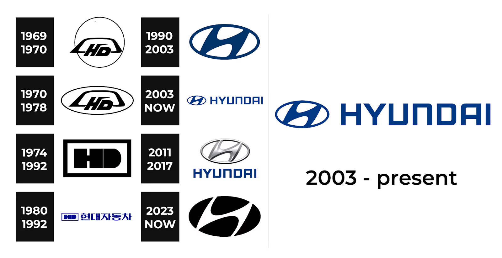
Here is a timeline of Hyundai’s logo evolution, starting from its inception.
The roots of Hyundai trace back to 1947 when founder Chung Ju-Yung established Hyundai Engineering and Construction. Though this was not the Hyundai Motor Company yet, the brand name “Hyundai”—meaning “modernity” in Korean—was set in motion. At this stage, there was no formal car logo, as the focus rested on construction and infrastructure projects. However, the essence of forward-looking innovation was already embedded in the company’s DNA.
Two decades later, in 1967, Hyundai officially launched its automotive division, Hyundai Motor Company. The earliest mark was purely textual, using uppercase letters to spell “HYUNDAI.” This straightforward approach often comes to mind when considering Hyundai's old logo. It was simple, unadorned, and delivered the brand name without any symbolic flair. The brand identity was not a central priority then—building reliable cars for the local market was.
In 1968, Hyundai partnered with Ford to assemble models like the Cortina for the Korean market. This era saw a mix of both Ford and Hyundai references on the vehicles. The Hyundai old logo during these years remained a rudimentary text treatment—large block letters, typically white on darker backgrounds or black on lighter surfaces. There was little emphasis on artistry, as brand equity was still nascent.
When the Hyundai Pony launched in 1975, it became the first Korean-developed mass-production car exported internationally. Though the wordmark was still the primary logo, Hyundai began to explore variations in font style and thickness, testing minor updates to appear more contemporary. The brand name was always prominent on the cars, but these visual tweaks hinted at Hyundai’s growing desire to stand out among established automakers.
By 1979, Hyundai set its sights on larger export markets. The Hyundai old logo was revised to be slightly bolder, allowing for improved readability from a distance. This subtle design shift helped reinforce Hyundai’s identity when rolling out more vehicles regionally. If you compare brochures from 1968 to 1979, you see a more precise, heavier font that projects greater confidence while still lacking a unique emblem.
As global competition intensified, Hyundai realized the need for a cleaner, more modern look. One thousand nine hundred eighty minor typographical tweaks included balanced spacing between letters and slightly sharper corners. The design changes were not dramatic, but collectively, they made Hyundai's old logo more visually coherent, reflecting Hyundai’s ambitions to streamline production and branding.
By 1983, public awareness of Hyundai as a car manufacturer began to pick up overseas. This prompted efforts to ensure that the wordmark could be quickly recognized in showrooms. Though still absent any symbolic shape or motif, the brand’s uppercase letters took on a more professional polish, making “HYUNDAI” more straightforward to spot. The brand was quietly preparing for its next big leap into international markets.
In 1986 Hyundai introduced Excel in the United States, marking a significant milestone. The car's label still featured the textual Hyundai old logo—straightforward capital letters. American buyers first encountered this name, associating it with an inexpensive yet accessible alternative to established brands. Though the branding was unremarkable, it served its purpose, announcing Hyundai’s arrival on a significant stage.
By the late 1980s, executives recognized the need for a distinctive emblem to match Hyundai’s success. Discussions occurred about moving beyond plain text, although no significant changes had yet. However, internal design teams experimented with shapes and lettering, foreshadowing the transformation that would emerge in the 1990s.
In 1990, Hyundai’s design team began exploring sketches for an emblem that could differentiate the brand globally. Concepts ranged from stylized letters to abstract shapes. None were publicized, but the groundwork was laid for the slanted “H.”
Everything changed in 1992 when Hyundai introduced the iconic oval emblem with a forward-leaning “H.” This defining moment marked Hyundai’s departure from its old logo and transition to a more symbolic representation. The slanted “H” was said to symbolize two individuals shaking hands: Hyundai and the customer. This handshake concept underscored the brand’s commitment to partnership and trust.
In a gr, Hyundai gradually phased out badges on Hyundai Citsme models and retained the old badge during a transitional period. Still, marketing materials increasingly showcased the stylized “H” in an oval. You might recall that other automakers also embraced sleeker emblems around this time. Hyundai positioned itself as an innovator, which is y essential for a brand keen on shedding a budget-only reputation.
By 1995, the modern oval emblem had appeared on most Hyundai models worldwide. Dealerships updated signage, brochures featured the stylized “H,” and the brand gained uniformity across various continents. Though the old wordmark was still used in some marketing, the oval rapidly became Hyundai’s primary visual identifier.
In 1999, Hyundai started experimenting with metallic finishes on the oval emblem, reflecting a popular trend among automakers like Toyota, Honda, and Kia. This was the first time Hyundai’s logo adopted a chrome-like sheen, lending a sense of modern design and quality. This metallic treatment bridged the gap between the simpler Hyundai old logo and the more upscale aesthetic Hyundai wanted to project.
As the new millennium dawned, nearly all Hyundai vehicles sported the metallic oval. Whether you saw a compact Accent or a mid-sized Sonata, the slanted “H” in chrome was front and center on the grille and trunk. These consistent brand elements showcased Hyundai’s commitment to uniform global branding—something it lacked with the Hyundai old logo decades prior.
In 2004, Hyundai refreshed its wordmark typography to match the oval emblem better. The new typeface shared structural similarities—clean lines and slightly rounded edges—to match the handshake-inspired “H visually.” Though subtle, these changes harmonized the text “HYUNDAI” with the emblem, giving it a unified appearance on everything from ads to dealership signs.
Around 2007, Hyundai began its “Drive your way” marketing campaign, emphasizing improved quality, advanced engineering, and stylish design. The metallic oval took on a more refined gradient to mirror Hyundai’s elevated brand image. The badge appeared slightly embossed in certain marketing materials, strengthening the perception that Hyundai was now serious about premium features, not just affordability.
When Hyundai debuted its luxury Genesis model in 2009, it introduced a separate winged emblem for that lineup. This sub-brand identity was distinct, yet most of Hyundai’s offerings retained the main stylized “H.” The success of the Genesis line demonstrated that Hyundai had effectively built enough brand equity to support premium offshoots—unthinkable in the Hyundai old logo era.
With the rise of mobile apps and online car shopping, Hyundai introduced flatter, two-dimensional versions of its emblem for websites and digital banners in 2010. However, while the cars continued to feature metallic badges, digital spaces required more straightforward, streamlined images that could load quickly and remain sharp at varying screen resolutions.
In 2012, Hyundai launched multiple new models, such as the Veloster and i30, each showcasing modern curves and fresh styling. The badge underwent minor polishing to appear more sculpted, matching the brand’s push toward progressive design. On marketing materials, you might notice the emblem sporting subtle shading to suggest depth without sacrificing digital clarity.
When Hyundai revealed the “N” performance sub-brand in 2015, the central “H” emblem remained on each model’s grille. However, the sporty “N” badge appeared on specific performance-oriented versions. This showcased Hyundai’s ability to expand into market segments without losing brand cohesion.
Continuing the minimalist trend, Hyundai simplified the textual portion of its brand identity in 2018. The letters in “HYUNDAI” became slightly tighter in spacing, creating a balanced, futuristic vibe. While still overshadowed by the oval “H,” the text-only logo saw enough refinement to integrate beautifully with the primary badge in ads and promotional materials.
In 2020, Hyundai announced the Ioniq sub-brand for its electric and plug-in hybrid vehicles. These EVs still bear the primary oval logo, reinforcing the continuity between Hyundai’s past and future. Even though the brand explores advanced propulsion, the hallmark “H” remains a consistent emblem of reliability, resonating with longtime fans and new EV adopters alike.
By 2021, Hyundai adopted a flattened 2D version of the slanted “H” for digital applications, following the global minimalism trend. While physical cars typically maintain a metallic or gloss emblem, websites and apps use a flat logo for quick loading and a crisp appearance. This balance showcases Hyundai’s adaptability while preserving the design language established in 1992.
To cater to different markets, Hyundai occasionally modifies the emblem’s surface finish—glossy in some locales, brushed metal in others. However, the shape remains unchanged worldwide, highlighting a significant difference from the old logo era, when brand visuals often varied drastically. Thanks to this unwavering global consistency, you can spot a Hyundai anywhere and instantly identify the brand.
Hyundai’s leadership has hinted at more streamlined designs to come. The brand continues its push into electric and hydrogen-powered vehicles, and the central “H” in an oval—whether metallic, flat, or digitally animated—stands as a unifying symbol. This unwavering emblem underscores Hyundai’s pledge to embody modernity, innovation, and a customer-centric approach, the same qualities that guided its earliest days.

The transformation is striking if you compare the current emblem to the old Hyundai logo. The old wordmark was a decent introduction but lacked storytelling power. When Hyundai introduced the slanted “H” that resembled two figures shaking hands, the brand moved beyond being just a name on a trunk or brochure. It formed an identity that carried emotional weight, bridging the company’s forward-thinking approach with drivers’ aspirations.
Moreover, the oval design provided a consistent, recognizable shape adaptable to everything from compact sedans to premium crossovers. This was impossible with the older text-based branding, which lacked the flexibility to scale elegantly or capture attention in a crowded global market.
Close your eyes and consider the journey from the Hyundai old logo—an unassuming text mark—to the sophisticated oval “H” recognized worldwide. Each stage in the year-by-year timeline highlights Hyundai’s evolution from a small construction firm to a technologically advanced automotive innovator. This emblem, now synonymous with reliability and forward momentum, did not materialize overnight. Every subtle font update and every redesigned badge brought Hyundai closer to international acclaim. Much like the handshake-inspired “H” suggests, Hyundai’s success story rests on a partnership of brand trust, customer satisfaction, and an unwavering commitment to modernity.
In the earliest days, the Hyundai old logo was essentially the word “HYUNDAI” in uppercase letters, set in a plain and blocky font. Although it helped introduce the brand name to local and international markets, it offered no symbolic elements now seen in the stylized oval “H” emblem. Its primary purpose was functionality—placing the Hyundai name on cars without much additional flair.
Hyundai officially debuted the stylized “H” encased in an oval in 1992, marking a pivotal shift away from text-only designs. The forward-leaning “H” represents two individuals shaking hands, symbolizing the company and the customer. This handshake concept underscores Hyundai’s focus on trust, partnership, and customer satisfaction.
The company's global growth and evolving design ambitions drove the transition from Hyundai's old logo to a graphic emblem. A simple wordmark did not offer the strong visual identity needed to stand apart in crowded international markets. By adopting the slanted “H” within an oval, Hyundai gained a more memorable symbol that conveyed modernity, trust, and innovation, aligning with the brand’s forward-looking mission.
Hyundai no longer uses the Hyundai old logo for its new vehicles or significant marketing campaigns. However, older models and vintage ads might still display the more straightforward text-based mark. Collectors of classic Hyundai cars sometimes seek out original badges and signage featuring the older logo. Today, the company is fully committed to the stylized “H” emblem, with occasional variations in finish (metallic or flat) depending on the model or market.


Discover how 500,000+ businesses and creators are using our AI logo maker in their Logo creation.


