The Kung Fu Panda Logo
Explore the design, evolution, and cultural significance of the Kung Fu Panda logo, symbolizing the film’s iconic characters, themes, and timeless values.

Explore the design, evolution, and cultural significance of the Kung Fu Panda logo, symbolizing the film’s iconic characters, themes, and timeless values.

.png)
The Kung Fu Panda franchise has been a favorite of audiences worldwide since its debut in 2008. A unique blend of action, humor, and heart, the movies have earned a special place in the hearts of fans across generations.
One of the most memorable aspects of the franchise is its logo, which encapsulates the essence of the films and its central character, Po the Panda. In this article, we’ll dive deep into the Kung Fu Panda logo's design, its evolution, its cultural significance, and the impact it has had on the branding of the franchise. From the first movie to the merchandise and digital branding, the Kung Fu Panda logo is a testament to the power of design and symbolism.
Before diving into the details of the color scheme, it's important to understand how the choice of colors in the Kung Fu Panda logo plays a vital role in conveying the film's themes and setting the tone for its visual identity.

Each color used in the logo is carefully selected to reflect the essence of the character, the storyline, and the cultural significance. Let’s explore:
The Kung Fu Panda logo is designed to be simple yet powerful. The most iconic element is the silhouette of Po, the titular panda, depicted in an action-packed, kung fu stance. This design immediately conveys the film’s theme of a humble, unlikely hero who discovers his true potential through determination, training, and heart. The panda, being the central character, is not just a cute animal; it represents the strength and wisdom that Po eventually discovers.
The logo's design combines elements of Eastern philosophy, kung fu, and adventure. The action pose of Po reflects the dynamic energy of the film, while the round shape of the logo mirrors the traditional Chinese design of unity and completeness. The circle, commonly seen in Chinese art, symbolizes balance, harmony, and the cyclical nature of life, which aligns perfectly with Po’s journey of self-discovery and growth.
The color palette used in the Kung Fu Panda logo is one of its most striking features. The primary colors are black, white, and gold—each of which carries deep significance.
The typography of the Kung Fu Panda logo is bold and strong, with angular, sharp edges that convey a sense of martial arts precision and power. The font resembles traditional Chinese calligraphy, creating a seamless connection to the movie’s cultural roots. The text, "Kung Fu Panda," is presented in a way that feels both dynamic and rooted in ancient traditions. It’s a blend of modernity and heritage, much like the movie itself.
The title "Kung Fu Panda" stands prominently in the logo, ensuring that the brand is immediately recognizable. Its placement at the bottom anchors the design, while Po’s silhouette takes the spotlight at the top, adding balance and symmetry.
The evolution of the Kung Fu Panda logo reflects the growth of the franchise, adapting to the changing themes and storylines with each new installment. As the films progress, the logo undergoes subtle yet significant transformations, incorporating elements that mirror the evolving narrative and deeper character development. Let’s explore how the logo has changed from the first movie to the latest release, maintaining its core identity while embracing new visual styles.
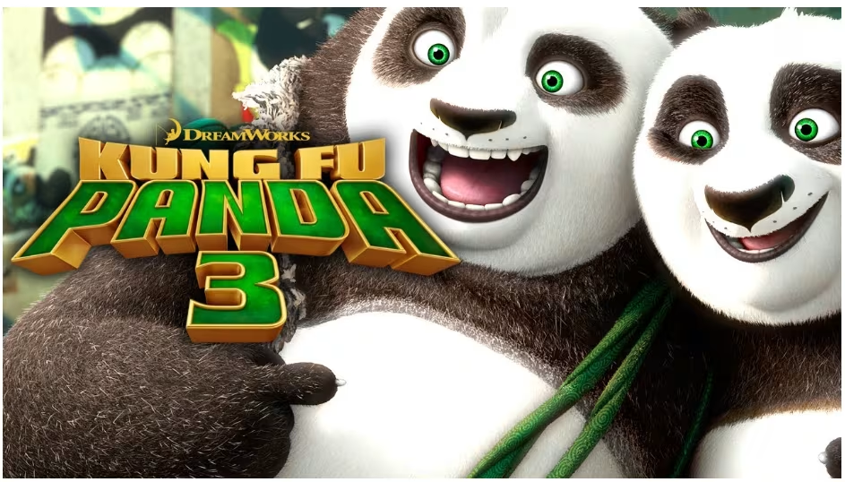
The original Kung Fu Panda logo, unveiled in 2008, set the tone for the entire franchise. It featured Po in a powerful pose, accompanied by bold typography. Over time, the logo evolved with the release of the sequels, each retaining the essence of the original design while adapting to the new narratives and characters introduced in Kung Fu Panda 2 (2011) and Kung Fu Panda 3 (2016).

The Kung Fu Panda logo also underwent subtle changes to suit various merchandising needs. On posters and DVD covers, the logo often included vibrant colors and patterns that matched the theme of the movie. For toys and products aimed at younger audiences, the logo was softened with brighter shades and rounded edges, making it more appealing to children.
Merchandise featuring the logo, from action figures to clothing, has played a huge role in the franchise’s success. The iconic panda symbol has become synonymous with adventure and fun, helping to boost the popularity of the films across various markets.
The Kung Fu Panda logo not only represents the film’s vibrant characters but also serves as a symbol of the deeper cultural themes woven throughout the story. By drawing from traditional Chinese philosophies and martial arts, the logo connects audiences with the essence of the film’s world. In this section, we'll dive into how the logo reflects Chinese culture and the symbolism behind Po the Panda, who is both the face of the franchise and a representation of the values at its heart.
One of the most notable aspects of the Kung Fu Panda logo is its connection to traditional Chinese culture. The film, directed by John Stevenson and Mark Osborne, pays homage to kung fu and ancient Chinese philosophies, which are reflected in the logo’s design. The combination of black and white, the circular shape, and the martial arts imagery all draw from the principles of Taoism, which emphasize balance, harmony, and the interconnectedness of all things.
In addition to the film’s visual design, the logo itself acts as a bridge between Eastern traditions and Western audiences. The logo's use of Chinese characters, stylized font, and martial arts imagery helps immerse viewers in the world of Kung Fu Panda, making it both relatable and deeply rooted in Chinese heritage.
Po, the lovable and clumsy panda, is the heart of the franchise. The logo captures his journey of transformation from a carefree noodle shop worker to the revered Dragon Warrior. The panda, an animal deeply associated with China, represents both wisdom and strength, making Po’s character the perfect symbol of growth and perseverance.
The Panda’s round shape in the logo aligns with his character’s development—he starts as an outsider, unsure of his worth, but through dedication and hard work, he becomes a hero. The logo captures the essence of this journey, reflecting Po’s internal and external struggles as he strives to protect his people and discover his true purpose.
The Kung Fu Panda logo has played a pivotal role in the franchise’s immense popularity and recognition across the globe. Its iconic design has made the logo an instantly recognizable symbol of the brand, transcending movie screens and becoming a staple in various forms of media and merchandise.
In this section, we’ll explore how the logo has contributed to the franchise's brand recognition and how it has influenced the merchandising success of Kung Fu Panda, helping to expand its reach and solidify its place in pop culture.
Since the release of the first film in 2008, the Kung Fu Panda logo has become synonymous with the franchise’s global success. The simple yet powerful design ensures instant recognition, making it one of the most iconic logos in modern animated film history. Whether it’s seen on a toy, a t-shirt, or a movie poster, the logo has the power to immediately evoke the sense of adventure, fun, and heart that the Kung Fu Panda films are known for.
The Kung Fu Panda logo has been integral to the franchise's merchandising strategy. The logo appears on a wide variety of products, from action figures and school supplies to clothing and video games. Each product captures a different aspect of the logo's significance—whether it’s Po’s strength, determination, or humor. These items have not only expanded the franchise's reach but also allowed fans to connect with the characters and world of Kung Fu Panda in meaningful ways.
For instance, the franchise has generated over $1.8 billion globally in box office revenue and has a massive following among children and adults alike. Merchandise sales have contributed significantly to this success, with many fans eager to own a piece of the Kung Fu Panda world.
The Kung Fu Panda logo has seamlessly transitioned from being a static symbol in movie theaters to an essential element of the franchise’s digital identity. As digital media and online platforms have become increasingly dominant, the logo has found its place across various online channels, ranging from video games and social media to interactive apps and websites. This ability to adapt to different digital formats has allowed the logo to maintain its iconic status and resonate with a new generation of fans.
The logo’s clean, bold design is especially suited for digital platforms. Its simplicity ensures that it remains easily recognizable, whether displayed on small mobile screens, social media posts, or large digital billboards. The contrasting black, white, and gold color scheme also ensures that the logo stands out, even in cluttered or fast-moving online environments. As a result, it has become a visual staple of the Kung Fu Panda franchise in the digital age, conveying the same sense of adventure, excitement, and humor that the films do.
In the realm of video games, the Kung Fu Panda logo has been adapted in several creative ways, particularly in titles like Kung Fu Panda: Showdown of Legendary Legends. In this game, the logo is prominently displayed in menus, loading screens, and promotional materials, ensuring that players immediately associate the game with the larger Kung Fu Panda universe.
The logo serves as a visual anchor for the franchise, reminding players of the beloved characters and their iconic adventures. Similarly, mobile apps related to the franchise, such as Kung Fu Panda: The Dragon Knight, incorporate the logo in the user interface and promotional materials, maintaining its prominence and enhancing the interactive experience for users.
The logo’s use across social media platforms further bolsters its relevance in today’s digital landscape. Whether on Twitter, Instagram, or Facebook, the Kung Fu Panda logo is consistently used in posts promoting new content, updates, or special events, helping to maintain engagement with fans. The logo’s adaptability to both digital promotions and user-generated content allows it to thrive on these platforms, reaching millions of users and reinforcing its status as a cultural icon.
The Kung Fu Panda logo is more than just a design; it is a powerful symbol of the franchise’s themes of self-discovery, perseverance, and cultural celebration. From its origins in the first film to its evolution across the sequels and beyond, the logo has become an integral part of the Kung Fu Panda brand. Through its simplicity, cultural references, and connection to Po’s character, the logo has captured the hearts of audiences worldwide.
As the franchise continues to grow and evolve, the Kung Fu Panda logo will undoubtedly remain a symbol of adventure, strength, and the timeless journey of discovering one’s true potential.
The Kung Fu Panda logo symbolizes Po’s journey from a clumsy panda to the Dragon Warrior. It combines elements of Chinese philosophy, kung fu, and adventure, with the panda representing strength, wisdom, and self-discovery.
The logo's simplicity, bold design, and strong visual identity make it instantly recognizable. It captures the essence of the franchise and has been used effectively across various media, merchandise, and digital platforms, contributing to its iconic status.
The logo has evolved with each installment of the film. While maintaining its core identity, it adapted to reflect the changing themes of the films, such as darker tones in Kung Fu Panda 2 and family-centric elements in Kung Fu Panda 3.
The logo reflects traditional Chinese culture, drawing from Taoism, martial arts, and Chinese art. Its use of black and white, circular shapes, and martial arts imagery connects the film with Chinese heritage while making it relatable to a global audience.
The Kung Fu Panda logo has been adapted for use in video games, apps, and online platforms, where it maintains its visual impact and reinforces the franchise’s branding. It’s prominently featured in games like Kung Fu Panda: Showdown of Legendary Legends and other digital promotions.


Discover how 500,000+ businesses and creators are using our AI logo maker in their Logo creation.


