Olympic Logos and Symbols From 1924 to 2028
Discover the evolution of Olympic logos and symbols from 1924 to 2028. Learn how these designs have shaped the visual identity of the Games over the decades.

Discover the evolution of Olympic logos and symbols from 1924 to 2028. Learn how these designs have shaped the visual identity of the Games over the decades.


The Olympic Games are more than just a global sporting event—they are a cultural phenomenon that brings together nations, athletes, and audiences worldwide in a celebration of excellence, unity, and tradition. Every four years, the Games create unforgettable moments that transcend sports, leaving a lasting impact on history and society. Beyond the thrilling competitions and record-breaking performances, one of the most iconic and enduring aspects of the Olympics is its visual identity, defined by logos and symbols that represent each edition of the Games.
Each logo and symbol is carefully crafted to reflect the values, aspirations, and unique heritage of the Games it represents, making Olympic branding an essential part of the event’s legacy and global recognition.
Olympic logos and symbols serve as powerful representations of unity, national identity, and the spirit of global competition. They create lasting visual legacies that connect history, culture, and branding, making each Olympic Games uniquely memorable.
Olympic logos and symbols serve multiple purposes beyond aesthetics. They are powerful tools of branding, communication, and national pride. Each iteration tells a story, connects cultures, and leaves a lasting imprint on the global stage.
Every Olympic logo encapsulates the culture, heritage, and identity of the host country. These designs are not just artistic representations but are carefully crafted to symbolize national values, history, and aspirations.
For example, Paris 1924 featured a neoclassical design, reflecting France’s deep-rooted artistic and architectural heritage. In contrast, Tokyo 2020 embraced a futuristic yet minimalist aesthetic, showcasing Japan’s advanced technology and commitment to modernity. Similarly, Beijing 2008’s emblem, inspired by a traditional Chinese seal, fused calligraphy with athletic motion, embodying China’s cultural depth and Olympic spirit.
Through these logos, host nations convey their unique stories, ensuring their legacy extends beyond the duration of the games.
The Olympic rings are one of the most universally recognized symbols, representing unity, excellence, and international collaboration. Designed by Pierre de Coubertin in 1913, the five interlocking rings symbolize the coming together of the world’s continents through sport.
Each Olympic edition builds on this legacy by creating a unique logo that retains its global appeal while incorporating distinct regional elements. The consistency of Olympic branding ensures that every host city’s visual identity remains connected to the overarching Olympic spirit.
For instance, the Los Angeles 1984 logo introduced a dynamic star, embodying American ambition and innovation. Sydney 2000’s emblem depicted a figure in motion, inspired by Australia’s indigenous art, reinforcing inclusivity and movement. These designs serve as iconic markers of each Olympic chapter while maintaining worldwide recognition.
Olympic logos are not just symbols; they are branding powerhouses that drive merchandising, sponsorships, and promotional campaigns. These emblems appear on everything from billboards and digital media to athlete uniforms and memorabilia, contributing to the financial success of the Games.
Major brands like Coca-Cola, Adidas, and Visa incorporate Olympic logos into their marketing campaigns, leveraging their significance to enhance brand association with sportsmanship and excellence. Official merchandise, such as apparel, pins, and collectibles, heavily features Olympic branding, generating significant revenue for the host city and the International Olympic Committee (IOC).
Beyond merchandise, Olympic logos are integral to the Games’ visual identity, influencing ticket designs, venue decorations, and digital presentations, ensuring a cohesive and immersive experience for audiences worldwide.
Each Olympic symbol is a reflection of the era in which it was created, capturing historical events, artistic movements, and technological advancements.
For instance, the Moscow 1980 logo, with its bold, Soviet-inspired design, reflected the political tensions of the Cold War. Barcelona 1992’s colorful, abstract emblem symbolized Spain’s cultural resurgence post-Franco era. More recently, London 2012’s bold and unconventional logo sparked debate but underscored the Games’ modern and youth-focused approach.
These logos serve as historical artifacts, offering insights into the socio-political and artistic contexts of their respective periods. They do not just represent a sporting event but encapsulate moments in time that resonate long after the closing ceremony.
From the classical designs of Paris 1924 to the sleek, minimalist emblem of Los Angeles 2028, Olympic logos have continuously evolved to reflect changing artistic, cultural, and technological trends. Each logo captures the essence of its host nation while maintaining the timeless spirit of the Games.


Introduced in 1913 by Pierre de Coubertin, the founder of the modern Olympic Games, the Olympic Rings have become one of the most recognized symbols in the world. The five interlocking rings—blue, yellow, black, green, and red—represent the five inhabited continents (Africa, the Americas, Asia, Europe, and Oceania) coming together in the spirit of sportsmanship and competition.
Each color was chosen because, at the time of its design, every national flag in the world contained at least one of these colors, making the symbol universally inclusive. The rings' interlocking design emphasizes unity, international cooperation, and the shared values of the Olympic movement.
Over the years, the Olympic Rings have appeared on official flags, medals, uniforms, and branding materials, reinforcing the spirit of global togetherness and excellence in sports.
The Olympic Torch is a direct link between the ancient and modern Games. First introduced in the 1928 Amsterdam Olympics, the torch itself was inspired by the sacred flame that burned during the ancient Greek Olympics in Olympia. However, the torch relay tradition—where the flame is carried from Olympia to the host city—was introduced in 1936 for the Berlin Olympics.
The relay symbolizes the transmission of Olympic values across generations and continents. The flame is ignited in Olympia, Greece, using the rays of the sun to ensure its purity, and it embarks on a journey through various countries before reaching the Olympic cauldron at the Opening Ceremony. The lighting of the cauldron marks the official start of the Games and remains one of the most anticipated moments of the event.
The torch relay has also adapted to modern challenges, incorporating new elements like underwater relays, space travel (as seen with the Sochi 2014 torch, which was sent to the International Space Station), and diverse modes of transportation, reinforcing the idea of innovation while preserving Olympic traditions.
First introduced in the 1968 Grenoble Winter Olympics, Olympic mascots have since become an integral part of Olympic branding, marketing, and cultural representation. Initially, they served as fun, engaging characters for younger audiences, but over time, they evolved into powerful symbols of the host country’s culture, environment, and values.
Each mascot is carefully designed to embody elements of the host nation’s identity. Some memorable Olympic mascots include:
Mascots enhance Olympic marketing efforts, appearing on merchandise, digital content, and promotional campaigns. They help connect audiences to the Games on an emotional level, making the event more memorable and engaging, especially for children and families.
Olympic logos are more than just branding; they serve as visual markers of their time, reflecting evolving artistic, technological, and cultural trends. Over the decades, these logos have transformed significantly, adapting to new design philosophies, digital innovations, and the changing expectations of global audiences.
The evolution of Olympic logos showcases a shift from simple, emblematic designs to more intricate and adaptable visual identities.
As design trends continue to evolve, Olympic logos balance clean aesthetics with meaningful storytelling, ensuring they are versatile, scalable, and visually striking.
In recent decades, Olympic logos have become more focused on cultural storytelling, ensuring the host nation’s heritage, values, and artistic traditions are woven into the design.
This shift ensures that each Olympic logo is more than just an identifier; it serves as a symbol of national pride, resonating with both local and international audiences.
With the rise of digital media, Olympic logos are now designed for flexibility across various platforms, ensuring they look great on everything from billboards to smartphone screens.
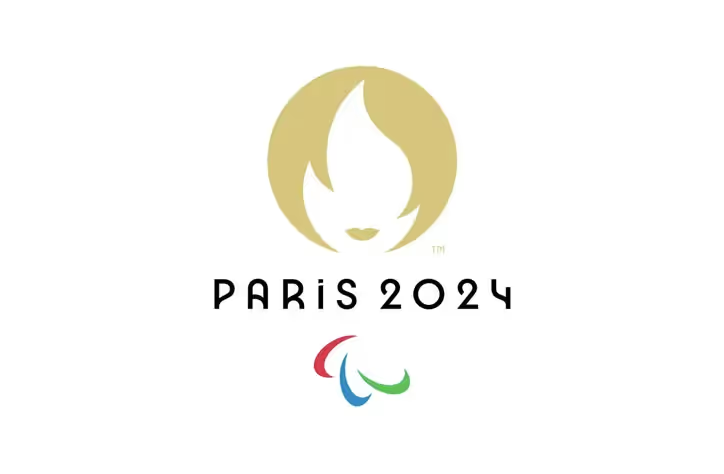
For example, the Paris 2024 logo features a sleek and modern design that transitions seamlessly between print, digital, and motion graphics, reflecting the need for fluidity in today’s media landscape.
As technology, design trends, and global values continue to evolve, Olympic logos will likely become more dynamic, interactive, and immersive, embracing cutting-edge innovations while maintaining the Games’ rich traditions. The future of Olympic branding will not only reflect artistic creativity but also leverage emerging technologies to enhance audience engagement and accessibility. With digital advancements playing an increasingly significant role in branding and marketing, future Olympic logos may go beyond static imagery, offering interactive and personalized experiences that connect with audiences in new and exciting ways.
With the growing influence of augmented reality, future Olympic logos could offer interactive experiences beyond traditional print and digital formats. Spectators might be able to scan the logo using their smartphones to unlock a variety of features, such as:
By integrating AR, Olympic logos could transform from static symbols into dynamic gateways, offering fans a richer and more engaging experience.
As artificial intelligence continues to revolutionize branding, future Olympic logos could adapt dynamically to different contexts, personalizing the visual identity based on regional preferences, audience demographics, and marketing strategies. AI-driven variations could enable:
This approach would ensure that the Olympic logo remains relevant, adaptable, and engaging, creating a more personalized and inclusive experience for global audiences.
As the world moves toward more sustainable practices, Olympic logos will likely reflect a stronger commitment to environmental responsibility and inclusivity. This shift could lead to:
By prioritizing sustainability and inclusivity, future Olympic logos will not only celebrate athletic excellence but also serve as symbols of the Olympic movement’s broader commitment to positive global change.
While Olympic logos have always evolved to reflect cultural, artistic, and technological trends, future designs will likely go even further, embracing digital interactivity, AI-driven personalization, and sustainable design principles. These innovations will ensure that the Olympic brand remains engaging, inclusive, and environmentally responsible, while still preserving its core message of unity, competition, and global celebration.
Olympic logos and symbols are more than just visual identifiers; they serve as powerful representations of the spirit, values, and history of the Games. Each logo encapsulates the artistic trends, national pride, and cultural influences of its era, offering a glimpse into the host country’s identity and vision for the event. From the classical elegance of Paris 1924, which emphasized tradition and artistry, to the digital dynamism of Los Angeles 2028, which embraces modern technology and bold innovation, Olympic logos have continuously evolved to reflect the changing world. Each design carries a deeper meaning, whether through historical references, symbolic colors, or innovative typography, ensuring that the Olympic brand remains fresh and relevant while honoring its rich past.
The rings represent the five continents coming together in unity for the Games.
Barcelona 1992 and Sydney 2000 are widely regarded as among the most memorable designs.
Each host country designs a mascot based on national culture, history, and themes relevant to the Games.
Each host city creates a unique logo to reflect its identity and the spirit of the Games.
With advancements in technology, we can expect more digital and interactive elements in future Olympic branding.


Discover how 500,000+ businesses and creators are using our AI logo maker in their Logo creation.


