Exploring Top 15 Brands With Red Logos and Their Design Secrets
Red logos grab attention! Discover the top industries using red, their meanings, and examples that pop. Curious about red's impact? Dive in now!
Red logos grab attention! Discover the top industries using red, their meanings, and examples that pop. Curious about red's impact? Dive in now!

Why do so many iconic brands paint their logos red? Step into the world of branding, and you'll find that red goes beyond being just a color—it's a symbol of passion, energy, and power. From fast-food giants to luxury labels, this bold hue stirs emotions, commands attention, and fuels brand loyalty. Let’s unravel the mystery behind why red reigns supreme in the logo game!
In this article, you'll find answers to questions like, "Which industries benefit most from red logos?" "What emotions do people connect with red?" and "How do specific shapes, size, dimension, and designs enhance a red logo’s impact?" Plus, we'll guide you on how to create your custom red logo easily.

Before we delve into the world of red logos, we’ll start by understanding the psychology and meaning behind the color red. Then, we'll analyze red logos from top brands to gather practical tips for your designs. By the end of this guide, you can answer questions like, "Is a red logo right for my brand?" and "How can I generate unique red logo ideas and design one for free?"
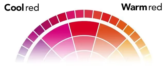
Not all reds are created equal, and those differences matter. Some reds are light, almost leaning toward pink. Others are deep and rich, like maroon or burgundy. Red can also have a warm or cool tone, giving off a distinct vibe. It’s easy to get mixed up between cool and warm reds. You might think you’re after a ‘warm red’ but choose a ‘cool red’ instead.
Remember your school art lessons? The color wheel shows that cool reds lean toward purple, while warm reds drift toward orange. But here’s the catch—many people associate the cooler reds with warmer feelings, which leads to confusion.

Red is a color that evokes strong emotions and has been used in branding to signify a variety of meanings, from warmth and love to danger and excitement.

In our daily lives, our understanding of red often comes from natural elements:
Red embodies warmth, love, energy, and passion, while also conveying courage, excitement, and revolution. If you want your brand to capture these powerful emotions, a red logo could be your perfect ally. Let’s explore how top brands have harnessed the dynamic power of red in their logos.
We’re not just listing the top red logos from major brands—we're diving deep into how they use different shades of red to create impact. By categorizing them by industry, you can easily find inspiration tailored to your sector. Explore the powerful symbolism of red in branding, discover the perfect shade for your brand, and learn from the best. Ready to ignite your brand's identity? Let's explore the world of red logos together!
When tech companies choose a red logo, they’re not just picking a color—they’re igniting a blaze of energy, passion, and innovation. Imagine red as the secret sauce that fuels a tech brand’s cutting-edge vibe.
Let’s take a closer look at how some tech giants use this fiery hue to make sparks fly and keep the industry buzzing.
Seeing red?

That’s Adobe, daring you to dive into the passion and power behind every creative stroke. This bold hue teases the limitless possibilities within Adobe’s tools, inviting you to unleash your imagination and paint outside the lines.
Ready to play?

YouTube’s iconic red play button isn’t just a logo; it’s an invitation to dive into endless streams of content. That bold hue pulses with energy, urging you to click and immerse yourself in the action that defines the world’s leading video platform.
Ever thought if Red can make you feel secure?

McAfee’s red shield isn’t just a logo; it’s a bold statement of courage and protection. That striking red color radiates passion and strength, perfectly embodying the fierce defense you expect from a top cybersecurity company.
Red makes you ready for innovation.

Oracle’s bold red wordmark does more than catch the eye—it declares the brand’s unstoppable energy and passion for groundbreaking database technology. This striking design embodies the spirit of revolution, driving the industry forward.
Red is the color of passion and pizzazz, and fashion brands use it to turn up the heat. Here’s how some top clothing brands rock red in their logos:
Get ready to feel comfortable with red.

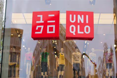
UNIQLO’s red square logo, with its crisp, evenly spaced letters, exudes warmth and energy. This vibrant backdrop isn’t just eye-catching—it reflects the brand’s dedication to delivering quality and cozy essentials that resonate with everyday life.
You can never go wrong in style with red.

H&M’s red cursive logo is more than just a design—it's a burst of passion and effortless chic. The vibrant red and flowing script capture the brand’s carefree, fashionable vibe, making every glance a nod to modern, trendsetting style.
Don’t miss the chance to catch the red wave in town!

C&A’s red circle with its classic typography radiates youthful energy and zest for life. The cozy, wave-edged design and vibrant hue perfectly capture the brand’s spirited and passionate approach to fashion.
Feeling the vibe?

Levi’s bold red logo, with its strong typography, channels energy and passion. The striking red highlights the brand’s dynamic spirit, while the sturdy typeface reinforces a sense of trust and reliability.

Red hot and ready to perform, NB’s logo screams passion and speed. That vibrant red color suggests a drive for athletic excellence and peak performance, fueling your every move.

A splash of red love: this iconic logo’s heart symbol pulses with passion and vibrancy. It perfectly encapsulates the essence of New York, radiating warmth and energy with every glance.
Red is the go-to for news networks looking to broadcast bold perspectives and a dedication to the truth. Here’s how red makes headlines in media logos:

Bold and red, CNN’s logo makes a powerful statement. The striking color and distinctive typography pulse with energy and urgency, reflecting the network’s commitment to delivering timely and impactful news.

Curved in red and ready for action, Netflix’s logo captures the brand’s passion for entertainment. The vibrant hue reflects a love for great content, while the sleek design hints at a widescreen experience, pulling viewers into a world of endless stories.
Red is a staple in the food and beverage world, sparking appetite and signaling freshness. Check out how some top brands use red to serve up flavor and appeal:

Coca-Cola’s red logo isn’t just iconic; it’s a global symbol of boldness and excitement. The vibrant hue embodies the brand’s refreshing taste and energetic spirit, making it instantly recognizable and irresistibly engaging.

Red as a warm embrace, KFC’s logo, featuring the Colonel’s iconic image, invites you to savor the comfort of home-cooked meals. The vibrant red background perfectly complements the brand’s cozy, homey vibe, making every meal feel like a comforting tradition.

Red radiates tradition and quality, hinting at the rich, flavorful essence of the products it represents. This bold hue captures a sense of heritage and deliciousness, making a memorable impact.
Red exudes energy and dynamism in the Red Bull logo. This vibrant hue perfectly reflects the brand’s high-octane spirit, suggesting a burst of vitality and excitement that fuels its adventurous image.

Red isn’t just a standout in logos; it’s also a dynamic choice for webpages. This bold color can capture attention, spark excitement, and drive engagement, making it a vibrant option for creating memorable and impactful online experiences. Here are some of the trending example, you must check out:
HireLevel's website masterfully leverages red to inspire action and evoke courage. Red elements are strategically placed to drive engagement, while the calming blue balances the intensity, reinforcing the company’s persona with a sense of trust and reliability.

This is the best example to show how to use red in highlighting what’s important. Kaber Technologies uses red with precision, directing focus to key messages and action areas. This selective approach ensures red stands out without overwhelming the user, effectively highlighting crucial elements on the site.

While red takes center stage in the logo, the Red website expertly blends it with neutral tones to soften any harshness. This thoughtful balance fosters feelings of courage and focus, using red to capture attention while ensuring a positive and impactful visual experience.

Ready to make your logo pop? Embrace red to spark your brand’s energy! Start by hunting for inspiration with keywords like “passion” and “energy,” and use tools like Logome AI logo maker for customizable templates.
Once you’ve chosen a template, tweak the colors, fonts, and layout to make it uniquely yours—play with shades of red to find the perfect fit for your brand. Add your name or slogan for that personal touch.
When your design is ready, download it in various formats and get set to showcase it across your website and social media. Remember, while red can ignite excitement and action, balance it with complementary colors to avoid overwhelming your audience.
Creating a red logo that captures your brand’s essence doesn’t have to be daunting. By understanding the psychology of red and seeing how top brands use it, you can craft a logo that looks great and resonates with your audience. Dive into the world of red logos and let your brand’s passion and energy shine through.
When used thoughtfully, red can enhance your marketing efforts, especially in driving action with call-to-action buttons.
Use red sparingly and purposefully, considering industry associations and balancing it with complementary colors for impactful branding and web design.


Discover how 500,000+ businesses and creators are using our AI logo maker in their Logo creation.


