Starbucks Emblem History: A Tale of Evolution and Iconic Identity
Discover the evolution of the Starbucks logo, starting with its original brown siren design in 1971 to the iconic green emblem we see now.

Discover the evolution of the Starbucks logo, starting with its original brown siren design in 1971 to the iconic green emblem we see now.


Few symbols are as universally recognizable as the Starbucks Siren, a logo that has evolved alongside the brand's journey. Our first logo, created by Terry Heckler in 1971, featured a topless siren encircled by the full name “Starbucks Coffee, Tea, and Spices.”

Starbucks logo originated in 1971 in Seattle, thanks to three friends—Jerry Baldwin, Zev Siegl, and Gordon Bowker—who shared a passion for quality coffee. They envisioned a welcoming spot where coffee enthusiasts could not only purchase premium coffee beans, brewing equipment, and spices but also connect over a shared love for a good cup of coffee. What started as a humble shop for coffee connoisseurs quickly grew into a social hub for those who appreciated the art of coffee.

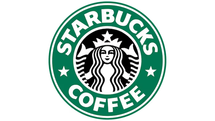
By 1987, when Il Giornale took over Starbucks, Heckler updated the design. The logo traded brown for green, giving the Siren a modern twist with a shorter name surrounding her. Fast forward to 1992, and the Siren's face became the focal point. By 2011, Starbucks unveiled the current sleek, minimalistic logo that no longer includes the company name—demonstrating the Siren’s strong independent identity.

The Starbucks logo is one of the most iconic symbols in the world, instantly recognizable even without the brand's name. However, this wasn't always the case. The logo has undergone a series of transformations since Starbucks was founded in 1971, each evolution reflecting the company’s growth, changing values, and expanding global influence.
From its origins featuring a brown, intricate depiction of a two-tailed siren to the sleek, green symbol we know today, the Starbucks logo tells a fascinating story of branding evolution. Dive into the timeline of the Starbucks logo's transformation and discover how it became the visual embodiment of a coffee empire.

n 1971, Starbucks introduced its very first logo, designed by graphic artist Terry Heckler. Drawing inspiration from a 16th-century Norse woodcut, Heckler crafted an intricate image of a topless siren holding two tails, embodying both allure and mystery. The logo was set in a rich brown color, reflecting the brand’s connection to coffee.
Encircling the siren were the words “Starbucks Coffee, Tea, and Spices,” which highlighted the diverse range of products available at the time. This design was a nod to the brand's maritime roots and its commitment to offering an exotic and inviting experience for coffee enthusiasts.

In 1987, when Howard Schultz acquired Starbucks, a transformative rebranding took place that reshaped the company’s visual identity and set the stage for its future growth. Schultz introduced a vibrant green color scheme to the logo, replacing the original brown, symbolizing freshness, vitality, and a bold new chapter for Starbucks.
The iconic Siren was also revamped, now more modestly depicted with her nudity covered by flowing hair, and the words "tea and spices" were removed to align with the brand’s refined focus on coffee. The logo was simplified with a more streamlined name, “Starbucks Coffee,” encircling the Siren, marking the transition from a local coffee shop to a recognizable global brand.
This rebranding was also a result of Starbucks’ merger with Il Giornale, Schultz’s own coffee company inspired by Milan's vibrant coffee culture. Starbucks had been an early investor in Il Giornale, providing beans for its beverages.
In 1987, when the Starbucks founders decided to sell, Schultz raised $3.8 million to purchase the company, merging the two brands and introducing the now-famous Starbucks green, along with two stars flanking the Siren. This union of Starbucks and Il Giornale signified the start of a new era, with the refreshed logo serving as a symbol of the brand’s evolution and its commitment to growth and innovation in the coffee industry.
The 1990s marked a period of rapid expansion for Starbucks, prompting the company to maintain brand consistency by making only subtle adjustments to its existing logo. In 1992, Starbucks introduced a light redesign, refining the Siren’s appearance by zooming in on her face and twin tails while her torso, previously visible, was now obscured by flowing hair. This update aimed to enhance brand recognition and provide a cleaner, more streamlined look that resonated with a growing global audience.
The green and white color scheme remained, reflecting the brand’s established image of freshness and growth. However, this logo version also encountered challenges, as its simplicity and widespread familiarity made it susceptible to imitation.
The increased ease of replication led to difficulties in distinguishing genuine Starbucks products from counterfeit ones, a testament to the logo’s iconic yet vulnerable design. Despite these challenges, the redesigned logo solidified the Siren’s status as the face of Starbucks, making her one of the most recognizable symbols in the world.

Starbucks’ 40th anniversary in 2008 prompted a rebranding effort to refresh the brand’s image. The logo was updated with a more stylized version of the Siren, aiming to capture the essence of a new, hipper Starbucks.
Despite the modern aesthetic, this version faced criticism and was met with resistance from loyal customers who preferred the classic green branding. This backlash led to a reevaluation of the logo design and a return to the brand’s roots.

In 2011, Starbucks unveiled a bold redesign, marking a significant departure from previous versions. The new logo featured a simplified, text-free design, focusing solely on the Siren. The removal of the company name, stars, and circular lines symbolized Starbucks’ confidence in its global brand recognition.
The logo's minimalist approach was a nod to the Siren’s strong identity, reflecting the company’s established position in the global market and its ability to stand on its own without text.
Starbucks' logo isn’t just a badge; it’s a story told through fonts, colors, shapes, and mythical charm. It's this clever blend of elements that continues to enchant millions, proving that the magic is in the details. So next time you grab your latte, take a moment to appreciate the Siren’s sly smile—she’s been brewing up connections longer than you think!. Starbucks’ logo is a masterclass in branding where every element plays its part. From fonts that make a statement to colors that brew up emotions, each detail has a role in telling the Starbucks story. Let’s take a closer look at these elements that have charmed coffee lovers worldwide.
While today’s Starbucks logo has gone minimalist without text, the bold typography from the past still holds a strong legacy. “Sodo-Sans Black,” a custom font designed exclusively for Starbucks, is a sans-serif typeface meant to be readable yet powerful, embodying the brand’s bold stance. Though the font has disappeared from the main logo, it continues to grace Starbucks’ packaging, like their iconic plastic cups. For a bit more flair, Starbucks also uses “Lander,” a serif font, and another sans-serif typeface called “Pike,” adding variety to their visual content.
Starbucks’ logo journey started with a rich brown, a color that’s not just about the beans but also symbolizes nature, stability, and, quite literally, coffee. It’s the color of coziness and warmth, inviting you to sit back and sip. However, as the brand evolved, so did its color palette. Enter green—the product of Starbucks’ union with Il Giornale, this hue symbolizes everything from growth and nature to wealth and healing. It’s not just green; it’s a promise of a fresh, vibrant, and valuable coffee experience that’s worth every penny.
Consistency is key, and Starbucks nailed it with the timeless circle shape of their logo. Circles in design are like the swiss army knives of shapes—they’re versatile, friendly, and perfect for adaptation across a variety of products. For Starbucks, the circle isn’t just about looking neat; it’s a continuous invitation, much like a warm hug from your favorite mug, to come back for more.

Let’s talk about the main star—the Siren, Starbucks’ enduring mascot. Inspired by Seattle’s maritime heritage, Terry Heckler drew from the myth of the siren, a sea creature known for luring sailors into her grasp. Similarly, Starbucks’ Siren aims to draw coffee lovers into its comforting embrace, promising an irresistible experience. This mythical figure is the face of Starbucks, embodying the allure and mystery of the perfect cup of coffee.
The Starbucks Siren has more depth than meets the eye. The original 1971 design, inspired by a 16th-century Norse woodcut, featured a more detailed and somewhat risqué Siren.
There’s a hidden gem within the Siren that not many have noticed. Over time, the logo underwent subtle adjustments to smooth imperfections and add a touch of humanity—such as making her eyes slightly asymmetrical in the 2011 redesign. During the 2011 rebrand, designers sought to humanize her slightly otherworldly appearance. Her face was reworked multiple times to balance between perfection and relatability. In the final design, they introduced a slight asymmetry—her right side is subtly elongated, making her face less than perfectly symmetrical. This tiny tweak added a touch of imperfection, a nod to the humanity and warmth that Starbucks brings to every cup, making the Siren not just a symbol but a reflection of the real, imperfect yet beautiful world of coffee lovers.

The Starbucks logo’s success lies in its ability to evolve while maintaining core elements that resonate with customers. The Siren’s transformation reflects the brand’s growth and adaptability.
The use of green and white colors not only differentiates Starbucks from competitors but also conveys a sense of nature and tranquility. The circular shape of the logo and the Siren’s symbolism contribute to a strong, memorable brand identity that continues to captivate audiences worldwide.
The timeline of Starbucks’ logo evolution showcases the brand’s journey from its humble beginnings to its current iconic status. Each redesign reflects a strategic response to changing market dynamics and customer preferences, reinforcing the importance of a strong and adaptable brand identity.
Starbucks is more than just a global coffee powerhouse; it's a brand with a rich history and a few surprises up its sleeve. From quirky origin stories to secret menu hacks, there's a lot more to Starbucks than meets the eye. Whether you're a daily coffee drinker or an occasional visitor, these fun facts will give you a fresh perspective on your favorite coffee spot!
Designed to be welcoming, Starbucks’ round tables help solo coffee drinkers feel less isolated and fit more people than traditional square tables.
Coffee masters at Starbucks, recognized by their black aprons, have mastered the art of coffee. They are your go-to experts for any coffee-related queries.
The original logo’s topless siren caused quite a stir, leading to a redesign that covered her torso with longer hair.
Starbucks boasts over 87,000 drink combinations, thanks to its customizable options and secret menu.
Since 2016, Starbucks has donated all its leftover food to those in need, showcasing a commitment to social responsibility. This initiative is a great example of how large-scale food drives can make a meaningful impact in local communities.
The Chantico drink, meant to be a rich European-style hot chocolate, was deemed too heavy and was quickly pulled from the menu.
Starbucks invests more in employee healthcare than in coffee beans, underscoring its commitment to staff welfare.
A lawsuit claiming Starbucks under-filled lattes was dismissed, highlighting the company’s legal challenges.
Even the CIA enjoys a Starbucks brew, with a store located at their Langley headquarters.
Starbucks' journey from a local coffee shop to a global powerhouse is marked by its iconic logo and rich brand story. The evolution of the Siren’s image reflects the company's growth and enduring appeal. For anyone building a brand, Starbucks offers a compelling lesson: Create a unique and memorable logo, tell a captivating story, and maintain a strong focus on customer experience.
Explore our blog to see how other brands have transformed their logos over time, and discover how you can apply these insights to your own brand. Learn more about creating impactful logos with our guide on “Shapes speaks louder than words” and see Logome’s AI-powered logo maker in action. Dive into the world of branding and unlock your creative potential today!


Discover how 500,000+ businesses and creators are using our AI logo maker in their Logo creation.


