Unlock the power of Serif Fonts for logo design! Explore 30+ classic & modern fonts, learn their secrets, and craft a timeless brand identity in this ultimate guide.
Your logo: it's the cornerstone of your brand identity, the first impression that captures attention and sets the tone. But have you considered the power of serif fonts in crafting that perfect logo? Serif fonts, with their elegant flourishes and timeless appeal, can elevate your logo design, imbuing it with a sense of trust, sophistication, or tradition. From the established might of Times New Roman to the modern allure of Calluna, this guide unveils 30 essential serif fonts, each with its own story and design magic. We'll delve into their origins, distinctive characteristics, and popular usage examples, empowering you to choose the perfect font that speaks volumes about your brand. So, buckle up and get ready to discover the hidden potential of serif fonts – the secret weapon that could transform your logo into a timeless masterpiece.
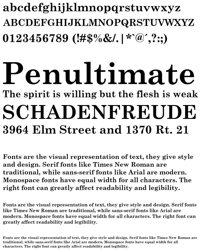
Times New Roman was designed by Stanley Morison and Victor Lardent in 1931 for the British newspaper The Times. This font was created as part of a modernization effort to improve the legibility and appearance of the newspaper. It quickly gained popularity due to its crisp, clear lines and balanced proportions, which make it highly readable at both small and large sizes. Its classic design is rooted in traditional serif styles, but it incorporates modern elements that give it a timeless appeal. Times New Roman’s widespread use has made it a standard typeface in the publishing industry, and it remains a go-to choice for many designers and typographers.
Source: Microsoft
Usage:
Used For: Times New Roman is predominantly used in newspapers and academic papers. Its clear and readable design makes it ideal for large blocks of text, which is why it is favored by educational institutions and scholarly publications.
Can Be Used For: This font is versatile and can be used for corporate documents, resumes, and websites. Its professional and polished appearance lends itself well to formal documents, business reports, and presentations.
Famous Usage Examples: The Times newspaper is the most notable example of Times New Roman’s use. Additionally, it is the default typeface for many word processing programs like Microsoft Word, and it has been extensively used in academic journals and research papers. Times New Roman is famously used in academic papers, including countless theses and dissertations. It is the standard font for many newspapers such as The Times of London.
Georgia was designed by Matthew Carter in 1993, specifically for on-screen readability. Carter's goal was to create a typeface that could be easily read on low-resolution screens, a common issue at the time. Georgia achieves this with its larger x-height, open counters, and slightly thickened serifs, which help maintain clarity and legibility on digital displays. The font is named after a tabloid headline that read "Alien Heads Found in Georgia," showcasing its ability to grab attention while maintaining a friendly and approachable appearance. Georgia’s classic serif design, combined with its digital optimization, has made it a staple in both web and print design.
Source: Microsoft
Usage:
Used For: Georgia is widely used for websites and digital content because of its excellent legibility on screens. It is often employed in web design for body text and long-form articles, where readability is paramount.
Can Be Used For: Beyond digital content, Georgia can also be used in print media, advertisements, and branding. Its classic style and clear legibility make it suitable for a variety of applications, including brochures, flyers, and posters.
Famous Usage Examples: Georgia has been used by major websites like The New York Times and the BBC, demonstrating its effectiveness in digital journalism. It is also used in various online platforms and blogs that prioritize readability and user experience.
Garamond is a group of many old-style serif typefaces named after the 16th-century French type designer Claude Garamond. The most popular versions today are Adobe Garamond, designed by Robert Slimbach in 1989, and Stempel Garamond. Garamond typefaces are renowned for their elegance and readability, characterized by a relatively small x-height, subtle contrast between thick and thin strokes, and bracketed serifs. These features contribute to a harmonious and aesthetically pleasing appearance, making Garamond a favorite among typographers and designers. The font's rich history and timeless design have cemented its place as a classic choice for a wide range of applications.
Source: Adobe
Usage:
Used For: Garamond is predominantly used in books and long-form text due to its excellent readability and elegant appearance. Its refined design enhances the reading experience, making it a popular choice for publishers and authors.
Can Be Used For: Garamond can also be used in branding, brochures, and high-end marketing materials. Its classic and sophisticated look makes it suitable for luxury brands, corporate identities, and print advertisements that require a touch of elegance.
Famous Usage Examples: Garamond has been used in the printing of the Harry Potter books, showcasing its appeal in popular literature. It is also used by major publishing houses and in a variety of classic literature, demonstrating its versatility and timeless charm.
Baskerville is a transitional serif typeface designed by John Baskerville in the 1750s. It is known for its high contrast between thick and thin strokes, sharp serifs, and generous proportions. Baskerville was created as an improvement over the old-style typefaces of the time, incorporating a more refined and elegant design. John Baskerville, a printer and typographer, sought to achieve greater clarity and readability in his printed works, which led to the development of this typeface. Baskerville's meticulous craftsmanship and attention to detail have made it a classic choice for a variety of applications, from book design to branding.
Source: Google
Usage:
Used For: Baskerville is widely used in books and newspapers, where its clear and elegant design enhances readability. It is a popular choice for body text and headings in printed materials, providing a sophisticated look to any publication.
Can Be Used For: Baskerville can also be used for corporate branding, web content, and advertisements. Its refined and professional appearance makes it suitable for business documents, websites, and marketing materials that require a touch of elegance.
Famous Usage Examples: Baskerville is commonly seen in classic literature and prestigious publications. It has been used by companies such as IBM for their corporate identity and by various high-end brands in their marketing materials.
Palatino is a humanist serif typeface designed by Hermann Zapf in the 1940s. Inspired by the calligraphic work of the Italian Renaissance, Palatino features broad proportions, open counters, and an elegant, flowing design. The typeface was named after the 16th-century Italian writing master Giambattista Palatino, reflecting its historical influences. Palatino's versatility and readability have made it a favorite among designers for both print and digital applications. Its timeless appeal and classic design elements have cemented its place as a staple in typography.
Source: Microsoft
Usage:
Used For: Palatino is commonly used in books and advertisements due to its readability and elegant appearance. It is ideal for body text and headings in printed materials, providing a classic and sophisticated look.
Can Be Used For: Palatino can also be used for corporate communications, digital interfaces, and branding. Its versatile design makes it suitable for a wide range of applications, from business reports to websites and marketing materials.
Famous Usage Examples: Palatino has been used in university publications and various corporate documents, showcasing its versatility and timeless appeal. It is also a popular choice for classic literature and high-end advertisements.
Bodoni is a modern serif typeface designed by Giambattista Bodoni in the late 18th century. It is characterized by its dramatic contrast between thick and thin strokes, flat serifs, and geometric shapes. Bodoni's design represents the peak of the neoclassical style in typography, emphasizing simplicity and elegance. The typeface's high contrast and refined appearance make it suitable for display purposes, where it can make a bold statement. Bodoni's influence can be seen in various modern typefaces, and its timeless design continues to be popular among designers and typographers.
Source: Google
Usage:
Used For: Bodoni is widely used in fashion magazines and high-end branding due to its dramatic and elegant appearance. It is ideal for headlines, logos, and other display purposes where a strong visual impact is desired.
Can Be Used For: Bodoni can also be used for book covers, luxury advertisements, and packaging. Its refined design makes it suitable for premium products and brands that want to convey a sense of sophistication and elegance.
Famous Usage Examples: Bodoni is famously used by Vogue magazine, where its high contrast and elegant appearance enhance the visual appeal of the publication. It is also used by various upscale brands for their logos and marketing materials.
Didot is a neoclassical serif typeface created by Firmin Didot in the late 18th century. It is known for its high contrast between thick and thin strokes, fine hairlines, and elegant, modern appearance. Didot's design was influenced by the rationalist principles of the Enlightenment, emphasizing clarity, order, and beauty. The typeface's precision and refinement make it suitable for high-end and luxury applications. Didot has been widely used in fashion, editorial design, and branding, where its sophisticated look can make a bold statement.
Source: Font Download
Usage:
Used For: Didot is commonly used in fashion publications and editorial design, where its high contrast and elegant appearance enhance the visual appeal of the content. It is ideal for headlines, logos, and other display purposes.
Can Be Used For: Didot can also be used for high-end branding, invitations, and packaging. Its refined design makes it suitable for luxury products and brands that want to convey a sense of sophistication and elegance.
Famous Usage Examples: Didot is famously used by Harper's Bazaar magazine, where its high contrast and elegant appearance enhance the visual appeal of the publication. It is also used by various luxury brands for their logos and marketing materials.
Caslon is a group of serif typefaces designed by William Caslon in the early 18th century. It is known for its readability, versatility, and classic design. Caslon's typefaces are characterized by their moderate contrast between thick and thin strokes, bracketed serifs, and relatively large x-height. These features contribute to a harmonious and aesthetically pleasing appearance, making Caslon a favorite among typographers and designers. The typeface's rich history and timeless design have cemented its place as a classic choice for a wide range of applications.
Source: Wikipedia
Usage:
Used For: Caslon is predominantly used in books and academic publications due to its excellent readability and classic appearance. Its refined design enhances the reading experience, making it a popular choice for publishers and authors.
Can Be Used For: Caslon can also be used in websites, corporate branding, and marketing materials. Its versatile and timeless look makes it suitable for a variety of applications, from business documents to brochures and advertisements.
Famous Usage Examples: Caslon was used in the printing of the Declaration of Independence, showcasing its historical significance. It is also used by Penguin Books and various classic literature, demonstrating its versatility and timeless charm.
Sabon is a serif typeface designed by Jan Tschichold in the 1960s, based on the Garamond typefaces of the 16th century. Sabon was created to be a versatile and elegant typeface that could be used across different media, including print and digital. It features a balanced design with moderate contrast between thick and thin strokes, open counters, and bracketed serifs. Sabon's readability and refined appearance have made it a favorite among designers and typographers. The typeface's classic design elements and modern functionality make it suitable for a wide range of applications.
Source: Font Download
Usage:
Used For: Sabon is commonly used in books and magazines due to its readability and elegant appearance. It is ideal for body text and headings in printed materials, providing a classic and sophisticated look.
Can Be Used For: Sabon can also be used for corporate branding, marketing materials, and digital content. Its versatile design makes it suitable for business documents, websites, and advertisements that require a touch of elegance.
Famous Usage Examples: Sabon has been used by Penguin Books and various classic literature, showcasing its timeless appeal. It is also used in university publications and corporate branding, demonstrating its versatility and refined design.
Clarendon is a slab serif typeface created by Robert Besley in the mid-19th century. It is known for its bold and robust design, characterized by its thick, blocky serifs and strong presence. Clarendon was originally designed for display purposes, such as headlines and posters, where it could make a bold statement. The typeface's strong and distinctive appearance has made it a popular choice for branding, signage, and advertising. Clarendon's versatility and readability have also led to its use in a variety of other applications, from print to digital media.
Source: Font Download
Usage:
Used For: Clarendon is widely used in headlines and posters, where its bold and robust design can make a strong visual impact. It is ideal for display purposes, such as banners, signs, and advertisements.
Can Be Used For: Clarendon can also be used for branding, web design, and packaging. Its strong and distinctive appearance makes it suitable for logos, corporate identities, and marketing materials that require a bold and memorable look.
Famous Usage Examples: Clarendon is famously associated with wanted posters in the Wild West, showcasing its historical significance. It is also used by various brands for their logos and marketing materials, demonstrating its versatility and strong visual appeal.
Rockwell is a slab serif typeface designed by the Monotype Corporation in 1934. It is characterized by its geometric shapes, even stroke widths, and strong presence. Rockwell's design is based on the principles of modernist typography, emphasizing simplicity and functionality. The typeface's bold and robust appearance makes it suitable for display purposes, where it can make a strong visual impact. Rockwell's versatility and readability have also led to its use in a variety of other applications, from print to digital media.
Source: Font Download
Usage:
Used For: Rockwell is widely used in posters and advertisements, where its bold and robust design can make a strong visual impact. It is ideal for display purposes, such as banners, signs, and marketing materials.
Can Be Used For: Rockwell can also be used for branding, web design, and packaging. Its strong and distinctive appearance makes it suitable for logos, corporate identities, and marketing materials that require a bold and memorable look.
Famous Usage Examples: Rockwell is famously associated with various advertisements and modern branding, showcasing its versatility and strong visual appeal. It is also used by various companies for their corporate identities and marketing materials, demonstrating its wide range of applications.
Century Schoolbook is a serif typeface designed by Morris Fuller Benton in 1918. It was created with readability and legibility in mind, making it a popular choice for educational materials. Century Schoolbook features a large x-height, open counters, and moderate contrast between thick and thin strokes. These characteristics contribute to its clarity and ease of reading, especially for young readers. The typeface's classic design and functional features have made it a staple in educational publishing, as well as a versatile choice for other applications.
Source: Font Download
Usage:
Used For: Century Schoolbook is predominantly used in textbooks and educational materials due to its readability and legibility. Its clear and functional design makes it ideal for large blocks of text, such as those found in school books and learning resources.
Can Be Used For: Century Schoolbook can also be used for children's books, corporate documents, and websites. Its friendly and approachable appearance makes it suitable for materials aimed at young readers and formal documents that require clarity.
Famous Usage Examples: Century Schoolbook is famously used in school textbooks and educational websites, showcasing its effectiveness in educational publishing. It is also used by various companies for corporate documents and reports, demonstrating its versatility and readability.
Trajan is a serif typeface designed by Carol Twombly in 1989, inspired by the letterforms on Trajan's Column in Rome. The typeface features an elegant and classic design, with tall, narrow proportions and finely crafted serifs. Trajan's design is based on the principles of classical Roman lettering, emphasizing clarity, order, and beauty. The typeface's timeless and sophisticated appearance makes it suitable for a wide range of applications, from movie posters to corporate branding. Trajan's elegance and historical significance have made it a favorite among designers and typographers.
Source: Font Download
Usage:
Used For: Trajan is widely used in movie posters and book covers, where its elegant and classic design can make a strong visual impact. It is ideal for display purposes, such as titles, logos, and other high-profile applications.
Can Be Used For: Trajan can also be used for logos, corporate branding, and editorial design. Its timeless and sophisticated appearance makes it suitable for prestigious brands and publications that want to convey a sense of elegance and tradition.
Famous Usage Examples: Trajan is famously used in movie posters for films like Titanic and Lord of the Rings, showcasing its effectiveness in high-profile and dramatic contexts. It is also used by various companies for their corporate identities and marketing materials, demonstrating its versatility and classic appeal.
Minion is a serif typeface designed by Robert Slimbach in 1990. It is a versatile and highly readable typeface, suitable for both print and digital applications. Minion features a balanced design with moderate contrast between thick and thin strokes, open counters, and classic proportions. The typeface was inspired by the humanist typefaces of the Renaissance, but it incorporates modern elements that enhance its functionality and readability. Minion's versatility and readability have made it a favorite among designers and typographers for a wide range of applications.
Source: Font Download
Usage:
Used For: Minion is commonly used in books and digital content due to its readability and versatile design. It is ideal for body text and headings in printed materials, providing a classic and sophisticated look.
Can Be Used For: Minion can also be used for corporate branding, advertising, and web design. Its balanced and elegant appearance makes it suitable for business documents, websites, and marketing materials that require clarity and professionalism.
Famous Usage Examples: Minion is used in various academic journals and corporate reports, showcasing its effectiveness in professional and formal contexts. It is also used by publishers for classic literature and other high-quality printed materials, demonstrating its versatility and refined design.
Janson is a serif typeface based on the designs of the 17th-century Hungarian type designer Miklós Kis. The modern version of Janson was developed by Chauncey H. Griffith in the 1930s. Janson features an elegant and readable design, characterized by its moderate contrast between thick and thin strokes, bracketed serifs, and relatively large x-height. These features contribute to its readability and aesthetic appeal, making Janson a favorite among typographers and designers. The typeface's classic design elements and historical significance have cemented its place as a timeless choice for a wide range of applications.
Source: Adobe Fonts
Usage:
Used For: Janson is commonly used in books and magazines due to its readability and elegant appearance. It is ideal for body text and headings in printed materials, providing a classic and sophisticated look.
Can Be Used For: Janson can also be used for branding, marketing materials, and digital content. Its versatile design makes it suitable for business documents, websites, and advertisements that require a touch of elegance.
Famous Usage Examples: Janson has been used in various classic literature and academic publications, showcasing its timeless appeal. It is also used by high-end brands for their marketing materials and corporate identities, demonstrating its versatility and refined design.
Bembo is a serif typeface designed by Francesco Griffo in the late 15th century and revived by Stanley Morison for the Monotype Corporation in 1929. It is named after the Italian scholar Pietro Bembo, whose works were originally printed using this typeface. Bembo is known for its elegance and readability, featuring a balanced design with moderate contrast between thick and thin strokes, open counters, and classic proportions. The typeface's historical significance and refined design have made it a favorite among designers and typographers for a wide range of applications.
Source: Microsoft Fonts
Usage:
Used For: Bembo is predominantly used in books and academic publications due to its excellent readability and classic appearance. Its refined design enhances the reading experience, making it a popular choice for publishers and authors.
Can Be Used For: Bembo can also be used in branding, marketing materials, and digital content. Its timeless and sophisticated look makes it suitable for business documents, websites, and advertisements that require a touch of elegance.
Famous Usage Examples: Bembo has been used in various classic literature and scholarly works, showcasing its historical significance. It is also used by high-end brands for their marketing materials and corporate identities, demonstrating its versatility and timeless charm.
Perpetua is a serif typeface designed by Eric Gill in the 1920s. It is known for its elegant and classic design, characterized by its tall, narrow proportions, fine serifs, and high contrast between thick and thin strokes. Perpetua was created as a display typeface, intended for use in titles, headings, and other prominent text. The typeface's refined appearance and historical influences make it suitable for a wide range of applications, from book design to corporate branding. Perpetua's timeless design and elegant features have made it a favorite among designers and typographers.
Source: Microsoft Fonts
Usage:
Used For: Perpetua is widely used in book covers and titles, where its elegant and classic design can make a strong visual impact. It is ideal for display purposes, such as headings, logos, and other high-profile applications.
Can Be Used For: Perpetua can also be used for logos, corporate branding, and editorial design. Its timeless and sophisticated appearance makes it suitable for prestigious brands and publications that want to convey a sense of elegance and tradition.
Famous Usage Examples: Perpetua is famously used in the cover design of classic literature and high-end publications, showcasing its effectiveness in prominent and dramatic contexts. It is also used by various companies for their corporate identities and marketing materials, demonstrating its versatility and classic appeal.
Goudy Old Style is a serif typeface designed by Frederic W. Goudy in 1915. It is known for its warm and friendly appearance, characterized by its moderate contrast between thick and thin strokes, open counters, and rounded serifs. Goudy Old Style was created as a book typeface, intended for use in body text and long-form reading. The typeface's readability and inviting design have made it a favorite among designers and typographers for a wide range of applications. Goudy Old Style's classic design and approachable features have cemented its place as a timeless choice for various projects.
Source: Identifont
Usage:
Used For: Goudy Old Style is predominantly used in books and magazines due to its readability and warm appearance. Its friendly design enhances the reading experience, making it a popular choice for publishers and authors.
Can Be Used For: Goudy Old Style can also be used in branding, marketing materials, and digital content. Its versatile and inviting look makes it suitable for business documents, websites, and advertisements that require a touch of elegance.
Famous Usage Examples: Goudy Old Style has been used in various classic literature and academic publications, showcasing its timeless appeal. It is also used by high-end brands for their marketing materials and corporate identities, demonstrating its versatility and warm design.
Mrs Eaves is a serif typeface designed by Zuzana Licko in 1996. It is named after Sarah Eaves, the wife of John Baskerville, and is based on the Baskerville typeface. Mrs Eaves features a refined design with moderate contrast between thick and thin strokes, open counters, and elegant serifs. The typeface's modern reinterpretation of a classic design has made it a favorite among designers and typographers. Mrs Eaves' versatility and sophisticated appearance make it suitable for a wide range of applications, from book design to branding.
Source: Indentifont
Usage:
Used For: Mrs Eaves is widely used in book design and editorial content, where its refined and elegant design can enhance the visual appeal of the text. It is ideal for body text, headings, and other printed materials.
Can Be Used For: Mrs Eaves can also be used for branding, marketing materials, and digital content. Its timeless and sophisticated appearance makes it suitable for prestigious brands and publications that want to convey a sense of elegance and tradition.
Famous Usage Examples: Mrs Eaves is used in various high-end publications and marketing materials, showcasing its effectiveness in prominent and dramatic contexts. It is also used by prestigious brands for their corporate identities and advertisements, demonstrating its versatility and classic appeal.
Old Standard TT is a serif typeface designed by Alexey Kryukov. It is inspired by traditional serif typefaces of the 19th and early 20th centuries, characterized by its classic proportions, moderate contrast between thick and thin strokes, and refined serifs. Old Standard TT was created as a versatile and elegant typeface, suitable for both print and digital applications. The typeface's timeless design and historical influences make it a favorite among designers and typographers for a wide range of projects. Old Standard TT's classic design and sophisticated features have cemented its place as a timeless choice for various applications.
Source: Google Fonts
Usage:
Used For: Old Standard TT is commonly used in books and academic publications due to its readability and classic appearance. Its refined design enhances the reading experience, making it a popular choice for publishers and authors.
Can Be Used For: Old Standard TT can also be used in branding, marketing materials, and digital content. Its timeless and sophisticated look makes it suitable for business documents, websites, and advertisements that require a touch of elegance.
Famous Usage Examples: Old Standard TT has been used in various classic literature and scholarly works, showcasing its historical significance. It is also used by high-end brands for their marketing materials and corporate identities, demonstrating its versatility and timeless charm.
Arno is a serif typeface designed by Robert Slimbach in 2007. It is inspired by the Renaissance typefaces of the 15th and 16th centuries, characterized by its classic proportions, moderate contrast between thick and thin strokes, and refined serifs. Arno was created as a versatile and elegant typeface, suitable for both print and digital applications. The typeface's timeless design and historical influences make it a favorite among designers and typographers for a wide range of projects. Arno's classic design and sophisticated features have cemented its place as a timeless choice for various applications.
Source: Adobe Fonts
Usage:
Used For: Arno is commonly used in books and academic publications due to its readability and classic appearance. Its refined design enhances the reading experience, making it a popular choice for publishers and authors.
Can Be Used For: Arno can also be used in branding, marketing materials, and digital content. Its timeless and sophisticated look makes it suitable for business documents, websites, and advertisements that require a touch of elegance.
Famous Usage Examples: Arno has been used in various classic literature and scholarly works, showcasing its historical significance. It is also used by high-end brands for their marketing materials and corporate identities, demonstrating its versatility and timeless charm.
Calluna is a serif typeface designed by Jos Buivenga in 2009. It is characterized by its modern and elegant design, with moderate contrast between thick and thin strokes, open counters, and refined serifs. Calluna was created as a versatile and readable typeface, suitable for both print and digital applications. The typeface's contemporary design and sophisticated features make it a favorite among designers and typographers for a wide range of projects. Calluna's modern design and refined appearance have cemented its place as a versatile choice for various applications.
Source: Identifont
Usage:
Used For: Calluna is widely used in books and digital content, where its modern and elegant design can enhance the visual appeal of the text. It is ideal for body text, headings, and other printed materials.
Can Be Used For: Calluna can also be used for branding, marketing materials, and web design. Its contemporary and sophisticated appearance makes it suitable for prestigious brands and publications that want to convey a sense of elegance and modernity.
Famous Usage Examples: Calluna is used in various high-end publications and marketing materials, showcasing its effectiveness in prominent and contemporary contexts. It is also used by prestigious brands for their corporate identities and advertisements, demonstrating its versatility and modern appeal.
Chaparral is a serif typeface designed by Carol Twombly in 1997. It is known for its unique blend of serif and sans-serif elements, characterized by its moderate contrast between thick and thin strokes, open counters, and robust serifs. Chaparral was created as a versatile and readable typeface, suitable for both print and digital applications. The typeface's distinctive design and sophisticated features make it a favorite among designers and typographers for a wide range of projects. Chaparral's unique blend of classic and modern elements have cemented its place as a versatile choice for various applications.
Source: Identifont
Usage:
Used For: Chaparral is widely used in books and digital content, where its unique blend of classic and modern elements can enhance the visual appeal of the text. It is ideal for body text, headings, and other printed materials.
Can Be Used For: Chaparral can also be used for branding, marketing materials, and web design. Its distinctive and sophisticated appearance makes it suitable for prestigious brands and publications that want to convey a sense of elegance and modernity.
Famous Usage Examples: Chaparral is used in various high-end publications and marketing materials, showcasing its effectiveness in prominent and contemporary contexts. It is also used by prestigious brands for their corporate identities and advertisements, demonstrating its versatility and modern appeal.
Playfair is a serif typeface designed by Danish designer Claus Eggers Sørensen. It is inspired by the transitional design of the late 18th century, a period that saw the introduction of pointed steel pens, which allowed for high-contrast letterforms. Playfair features elegant curves, sharp serifs, and a balanced structure that captures the sophistication of the Enlightenment era. The typeface's name pays homage to the influential Enlightenment-era type designer John Baskerville, reflecting its historical roots and refined aesthetics.
Source: Google Fonts
Usage:
Used For: Playfair is frequently used in editorial design, including magazines, newspapers, and books, where its elegant and readable design enhances the visual appeal of the text.
Can Be Used For: Playfair is also suitable for branding, especially for luxury and high-end brands, as well as digital content such as websites and blogs, where its sophisticated appearance adds a touch of elegance.
Famous Usage Examples: Playfair is used in the branding for the fashion magazine "Harper’s Bazaar," the design of the lifestyle website "Goop," and the layout for "The New York Times" digital edition.
Charter is a serif typeface designed by Matthew Carter in 1987. It is known for its readability and versatility, characterized by its moderate contrast between thick and thin strokes, open counters, and robust serifs. Charter was created as a typeface that would be suitable for both print and digital applications, making it a popular choice among designers and typographers. The typeface's functional design and sophisticated features make it a favorite for a wide range of projects. Charter's modern design and refined appearance have cemented its place as a versatile choice for various applications.
Source: Identifont
Usage:
Used For: Charter is widely used in books and digital content, where its readability and functional design can enhance the visual appeal of the text. It is ideal for body text, headings, and other printed materials.
Can Be Used For: Charter can also be used for branding, marketing materials, and web design. Its modern and sophisticated appearance makes it suitable for prestigious brands and publications that want to convey a sense of elegance and modernity.
Famous Usage Examples: Charter is used in various high-end publications and marketing materials, showcasing its effectiveness in prominent and contemporary contexts. It is also used by prestigious brands for their corporate identities and advertisements, demonstrating its versatility and modern appeal.
Helvetica is a widely recognized sans-serif typeface developed in 1957 by Swiss typeface designer Max Miedinger with input from Eduard Hoffmann. Originally named Neue Haas Grotesk, it was later rebranded as Helvetica, derived from "Helvetia," the Latin name for Switzerland. Helvetica is known for its clean, modern, and highly legible design. The typeface features uniform stroke width, tight spacing, and a no-nonsense, neutral appearance. Its simplicity and versatility have made it one of the most popular typefaces in the world, used in a variety of contexts from corporate branding to public signage.
Source: Identifont
Usage:
Used For: Helvetica is commonly used in corporate branding and identity, where its clean and professional look communicates reliability and modernity.
Can Be Used For: Helvetica can be used for print and digital design, including websites, apps, and interfaces, as well as advertising and marketing materials due to its versatility and readability.
Famous Usage Examples: Helvetica is used in the branding and logos for major corporations like American Airlines, BMW, and Panasonic. It is also famously used in New York City subway signage and in the layout for the 1976 redesign of the U.S. Postal Service logo.
Roboto is a serif typeface developed by Christian Robertson for Google as part of the Android operating system design overhaul in 2011. Roboto is characterized by its dual nature: it has a mechanical skeleton and largely geometric forms, yet its letter shapes feature friendly and open curves. The typeface strikes a balance between technical precision and humanist style, making it versatile for a variety of uses. It was designed to provide an optimal reading experience on screens, which is reflected in its clean, modern appearance and wide range of weights and styles.
Source: Font Meme
Usage:
Used For: Roboto is widely used for digital interfaces, particularly on Android devices and Google services, where its clarity and readability enhance user experience. It is the default font for the Android operating system and many Google applications.
Can Be Used For: Roboto can be effectively used for web design, mobile apps, and digital content, ensuring readability across different screen sizes and resolutions. Its versatility also makes it suitable for print materials such as brochures, posters, and corporate communications.
Famous Usage Examples: Roboto is the standard typeface for the Android operating system and is used across Google’s ecosystem, including in Google Docs and Google Maps. It is also employed in the design of websites like Medium and in the branding for the Material Design framework.
ITC Weidemann is a serif typeface designed by Kurt Weidemann in 1983. It is characterized by its contemporary design, featuring moderate contrast between thick and thin strokes, open counters, and sturdy serifs. ITC Weidemann was created to combine readability with modern aesthetics, making it suitable for both print and digital applications. The typeface's balanced design and refined features have made it a favorite among designers and typographers for a wide range of projects.
Source: Identifont
Usage:
Used For: ITC Weidemann is widely used in books and magazines, where its readability and modern design can enhance the visual appeal of the text. It is ideal for body text, headings, and other printed materials.
Can Be Used For: ITC Weidemann can also be used for branding, marketing materials, and web design. Its contemporary and sophisticated appearance makes it suitable for prestigious brands and publications that want to convey a sense of elegance and modernity.
Famous Usage Examples: ITC Weidemann is used in various high-end publications and marketing materials, showcasing its effectiveness in prominent and contemporary contexts. It is also used by prestigious brands for their corporate identities and advertisements, demonstrating its versatility and modern appeal.
Stone Serif is a typeface designed by Sumner Stone in 1987. It is part of the larger Stone type family, which includes sans-serif and informal variations. Stone Serif is known for its clarity and versatility, featuring moderate contrast between thick and thin strokes, open counters, and sturdy serifs. The typeface was designed with a functional approach, making it suitable for a wide range of applications from print to digital media.
Source: Identifont
Usage:
Used For: Stone Serif is commonly used in books, magazines, and newspapers due to its readability and clean design. It is ideal for body text, headings, and other printed materials.
Can Be Used For: Stone Serif can also be used for branding, corporate communications, and web design. Its versatile and professional appearance makes it suitable for business documents, presentations, and advertisements that require a touch of sophistication.
Famous Usage Examples: Stone Serif is used by various high-profile publications and brands, demonstrating its effectiveness in diverse contexts. Its balanced and clean design makes it a go-to choice for both print and digital applications.
Warnock is a serif typeface designed by Robert Slimbach in 2000. It is named after John Warnock, co-founder of Adobe Systems, and was created as a highly versatile and readable typeface. Warnock is characterized by its classic proportions, moderate contrast between thick and thin strokes, and refined serifs. The typeface's design combines traditional and modern elements, making it suitable for a wide range of applications from book design to corporate branding.
Source: Identifont
Usage:
Used For: Warnock is widely used in books, academic publications, and journals due to its readability and elegant design. It is ideal for body text, headings, and other printed materials.
Can Be Used For: Warnock can also be used for branding, marketing materials, and digital content. Its sophisticated and versatile appearance makes it suitable for prestigious brands and publications that want to convey a sense of elegance and tradition.
Famous Usage Examples: Warnock is used in various high-end publications and marketing materials, showcasing its effectiveness in prominent and sophisticated contexts. It is also used by prestigious brands for their corporate identities and advertisements, demonstrating its versatility and classic appeal.
Hoefler Text is a serif typeface designed by Jonathan Hoefler in 1991. It was created as a digital typeface that would embody the elegance and versatility of classic serif fonts. Hoefler Text features a high contrast between thick and thin strokes, finely detailed serifs, and a range of advanced typographic features such as swashes, ligatures, and small caps. The typeface was designed with both print and digital applications in mind, making it a favorite among designers who appreciate its refined aesthetics and versatility.
Source: Identifont
Usage:
Used For: Hoefler Text is widely used in high-end print publications, such as books and magazines, due to its elegant and detailed design. It is ideal for body text, titles, and headings.
Can Be Used For: Hoefler Text can also be used in branding, corporate communications, and digital content. Its sophisticated appearance and advanced typographic features make it suitable for prestigious brands and editorial design.
Famous Usage Examples: Hoefler Text has been used in The New York Times Magazine, displaying its elegance in high-quality editorial contexts. It is also a popular choice for luxury brands’ marketing materials and corporate identities, showcasing its versatility and classic charm.
Lora is a contemporary serif typeface designed by Olga Karpushina and published by Cyreal in 2011. The typeface is known for its balanced and modern aesthetics, combining traditional serif elements with a touch of calligraphic grace. Lora features moderate contrast between thick and thin strokes, which lends it a refined yet approachable appearance. Its well-defined serifs and moderate stroke contrast make it suitable for both screen and print use. Lora was designed with readability in mind, making it an excellent choice for long-form text.
Source: Google Fonts
Usage:
Used For: Lora is often used in editorial design, including magazines, newspapers, and books, due to its readability and elegant style. Its balanced proportions make it suitable for both body text and headlines.
Can Be Used For: Beyond editorial work, Lora can be used for branding, particularly for businesses looking to convey sophistication and reliability. It also works well in digital interfaces, such as websites and apps, where readability and aesthetics are crucial.
Famous Usage Examples: Lora is used by Medium for its article text, providing a pleasant reading experience on both desktop and mobile screens. It is also used in the branding of cultural institutions like the Tate Modern, as well as in the design of various literary publications and academic journals.
Abril Fatface is a modern serif typeface designed by Veronika Burian and José Scaglione, and released by TypeTogether in 2011. The typeface is part of the larger Abril family, which draws inspiration from 19th-century European advertising posters. Abril Fatface stands out with its high contrast between thick and thin strokes, its elegant curves, and its dramatic, bold appearance. This makes it particularly suitable for headlines, logos, and branding materials that need to make a strong visual impact. Despite its boldness, Abril Fatface retains a sense of refinement and sophistication, making it versatile for various design applications.
Source: Identifont
Usage:
Used For: Abril Fatface is widely used for headlines, titles, and branding due to its eye-catching, high-contrast design. Its bold and dramatic appearance ensures that it captures attention and conveys a sense of elegance and style.
Can Be Used For: Abril Fatface can also be used in posters, packaging, and web design. While primarily suited for display purposes, it can also work in short blocks of text where emphasis is needed. Its distinctive style can add a touch of sophistication to invitations, menus, and other printed materials.
Famous Usage Examples: Abril Fatface is used in the branding of The Guardian newspaper, where it helps create a distinctive and authoritative visual identity. It has also been used in the website design for Medium, giving the platform a modern and stylish look. Additionally, Abril Fatface is featured in the marketing materials for brands like Tate Modern, contributing to a contemporary and artistic aesthetic.
Serif vs. Sans-Serif
Serif fonts have small decorative strokes (serifs) at the ends of their characters, while sans-serif fonts lack these embellishments, resulting in a cleaner, more modern look. Serif fonts are often associated with tradition, elegance, and readability, making them popular for body text in print media. On the other hand, sans-serif fonts convey a more contemporary, minimalist feel and are commonly used for digital interfaces and branding.
Matching Your Brand Identity: Classic, Modern, Playful, or Bold?
Choosing the right font for your brand involves considering its personality and values. Classic serif fonts like Baskerville evoke sophistication and timelessness, ideal for luxury brands. Modern serif fonts like Playfair strike a balance between tradition and innovation, making them suitable for progressive brands. Playful serif fonts, such as Lora, add a whimsical touch, perfect for brands targeting a youthful audience. Bold serif fonts like Abril Fatface exude confidence and make a strong visual statement, ideal for brands aiming to stand out.
Logo Legends: Iconic Brands that Rock Serif Fonts
Several iconic brands have successfully incorporated serif fonts into their logos, contributing to their recognizable and enduring identities. Coca-Cola's script logo, using a custom serif font, reflects its heritage and longevity. The New York Times logo, featuring a modified version of the Cheltenham typeface, conveys authority and credibility. Tiffany & Co. utilizes the elegant serif font of its namesake for a timeless and luxurious brand image. These examples demonstrate the versatility and impact of serif fonts in logo design.
Free vs. Paid Serif Fonts
When selecting serif fonts for your projects, you'll encounter both free and paid options. Free serif fonts, available through platforms like Google Fonts and Adobe Fonts, offer a wide selection of styles without the cost. However, paid serif fonts often provide greater variety, quality, and support, making them worth the investment for professional projects and branding. Consider your budget, project requirements, and the level of customization and support needed when deciding between free and paid serif fonts.
Conclusion
In closing, serif fonts offer a treasure trove of possibilities for crafting a logo that speaks volumes about your brand. Whether you seek to convey a sense of heritage or a touch of contemporary elegance, there's a perfect serif font out there waiting to be discovered. Remember, your logo is a visual ambassador, so choose a font that reflects your brand's unique personality and resonates with your target audience. So, experiment, explore the options we've presented, and unleash the power of serif fonts to create a logo that leaves a lasting impression. After all, the right font choice could be the secret ingredient that elevates your brand from good to remarkable.
Varsha Singh
Varsha Singh is a professional SEO Content Writer holding more than 2 years of experience. She specializes in driving organic traffic and improving search engine rankings. Varsha's portfolio includes work for top-tier brands across various industries. Her skills in keyword research and on-page SEO make her a valuable asset. In addition to Spocket, she provides writing tips through her LinkedIn profile as well.