Windows Logo
Explore the fascinating evolution of the Windows logo, from its 1985 debut to the latest design updates in Windows 11. Discover its symbolism and impact on branding.

Explore the fascinating evolution of the Windows logo, from its 1985 debut to the latest design updates in Windows 11. Discover its symbolism and impact on branding.


Have you ever wondered how the Windows logo became so iconic? From its early days in the 1980s to the sleek, modern design we see today, the Windows logo has undergone a fascinating transformation. It's not just a logo; it's a symbol of innovation, progress, and the evolution of technology. But beyond the logo itself, there's a story behind each design shift — a story that reflects Microsoft's journey, the changing tech landscape, and even cultural trends.
In this article, we’ll take you on a journey through the history of the Windows logo. We'll explore its origins, the key changes it’s gone through, and the design decisions that shaped it. Whether you're a die-hard tech enthusiast, a graphic design aficionado, or just someone curious about the story behind the logo you see every day, you're in the right place. Ready to dive into the evolution of one of the most recognizable symbols in the tech world? Let’s get started.

The Microsoft Windows logo has become one of the most recognizable symbols in the world of technology. But before it became the iconic "flag" design we know today, it had humble beginnings. Let’s rewind to the mid-1980s, when Microsoft was preparing for its big leap into the personal computing world.
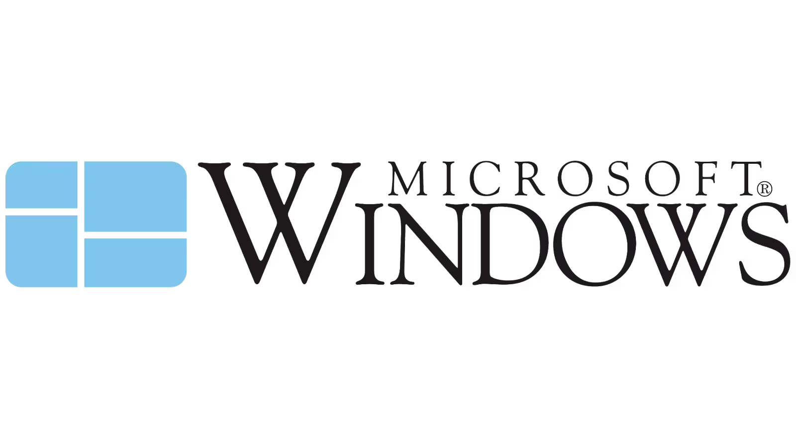
In 1985, Microsoft launched Windows 1.0, and with it came the very first version of the Windows logo. The original design was simple yet effective — a stylized window with four panes, reflecting the software’s name and purpose. Unlike the dynamic flag design we’re familiar with today, this early logo was more about function than flair. Its clean lines and basic colors set the stage for a brand that was just beginning to make its mark on the world.
This early logo was all about clarity. It was intended to represent the idea of a window into the digital world, with the idea that technology should be accessible and user-friendly. But, as we’ll see, Microsoft’s vision for the brand would evolve, as would the logo itself.

As the 1990s began, Microsoft was on the rise, and the Windows brand was about to undergo a major transformation. The early flag design, introduced in 1992, was refined and given a more vibrant and dynamic look to match the growing presence of Microsoft in the personal computing world. The new logo wasn’t just a cosmetic change—it reflected the energy and excitement surrounding the release of Windows 95, which marked a revolutionary shift in personal computing.
With Windows 95, Microsoft was ready to move from simple functionality to a more user-friendly, powerful, and engaging experience. The Windows logo, with its colorful squares and flowing flag design, embodied this shift perfectly. It was bright, bold, and full of energy—just like the new operating system. The logo was meant to symbolize movement and progress, aligning perfectly with the sense of innovation that Windows 95 brought to the table. The use of bright colors in the logo also added a sense of modernity, creating a visual identity that resonated with consumers.
The vibrant flag logo continued to represent Windows 98 as well, reinforcing the brand’s commitment to reliability and accessibility. As technology advanced and Microsoft’s user base grew, the colorful flag design became synonymous with personal computing, helping to solidify Windows’ place in millions of homes and offices around the world. This era of colorful and bold design laid the foundation for the modern Windows logo, making it an enduring symbol of innovation and progress in the tech world.

As the 21st century began, the tech world was shifting toward a more streamlined and minimalist aesthetic. This design trend was reflected in the Windows logo, which underwent another transformation to match the evolving tastes and expectations of the time. With the release of Windows XP in 2001, Microsoft made the decision to simplify the logo, embracing cleaner lines and a more modern look that aligned with the sleek interfaces of the new operating systems.
The vibrant colors of the 90s logo were toned down, and the flag-like design was refined, giving it a more polished and professional appearance. The flag was now represented in a smoother, more angular form, shedding some of the previous complexity. This simplified version of the logo allowed it to appear more versatile across various media, from desktop screens to advertising materials, maintaining its identity while feeling fresh and updated.
Windows XP itself was a milestone in the operating system’s evolution, offering users a more stable and intuitive interface. The new, minimalist logo captured the essence of this change, signaling a move away from the more playful, colorful designs of the past. It was more mature, sophisticated, and perfectly in line with the direction Microsoft was heading in, focused on providing a professional, reliable, and user-friendly computing experience.
This new approach to the Windows logo set the stage for future iterations. As technology continued to evolve, the simplified design of Windows XP’s logo would pave the way for the even more modern, minimalist trends that would dominate the coming years.

By the late 2000s, a new design philosophy was taking over the digital world: flat design. This movement, which prioritized simplicity and minimalism, would soon influence not just operating systems but entire industries. Microsoft, recognizing the need to stay ahead of design trends, embraced this shift with the release of Windows Vista in 2007 and continued with Windows 7 in 2009. The flat design aesthetic was clean, without the use of gradients, shadows, or textures, resulting in a more streamlined, modern appearance.
The Windows logo during this period underwent a significant transformation. Gone were the shiny effects and the 3D elements that had once made the logo pop. Instead, the design was reduced to simple flat colors and a smooth, two-dimensional look. The flag logo retained its basic shape but was now simplified further, with the colors appearing as solid, flat blocks. This new logo reflected the flat design trend sweeping the design world, which focused on clarity, usability, and a cleaner look.
The flat design of Windows 7’s logo became synonymous with the clean, straightforward experience the operating system aimed to provide. Windows Vista and 7 were all about speed and efficiency, and the new logo fit perfectly with this focus. The lack of visual clutter mirrored the design of the operating systems themselves, offering users a fresh, less distracting interface.
In a world increasingly focused on mobile interfaces and web applications, flat design was seen as the future. It worked well on screens of all sizes—from desktops to smartphones—making it adaptable and scalable. The Windows logo, with its simplified flat design, was now more versatile than ever, ensuring that it could seamlessly integrate into Microsoft's expanding product ecosystem.

By the mid-2010s, Microsoft had fully embraced a minimalist design approach. With the release of Windows 8 in 2012, the company took a bold step in reshaping not just the logo but the entire user experience. The era of skeuomorphic designs and overly detailed elements had passed, and minimalism was the new king. This period in design was all about clean, simple, and intuitive interfaces—something that could scale easily across all devices, from PCs to tablets and smartphones.
Windows 8 marked the logo’s most dramatic shift in terms of simplicity. The iconic flag remained, but the design was now more streamlined than ever. The colors were more subdued, and the logo was often presented as a flat, two-tone icon. The days of gradients, reflections, and shading were over—replaced by a crisp, modern, and minimalistic look that mirrored the tile-based interface of Windows 8 itself.
The new design aligned perfectly with the user interface changes in Windows 8, which introduced the Start screen with its colorful, tile-based layout. The Windows logo, in its minimalist form, became a visual symbol of the fresh direction Microsoft was taking—focused on speed, simplicity, and a seamless experience across devices.
However, not everyone loved the drastic change. Some users found the minimalist approach too stark and felt the logo lost some of its personality. Despite this, the minimalist design continued into Windows 10, reflecting the operating system's focus on a clean, modern, and functional user experience.
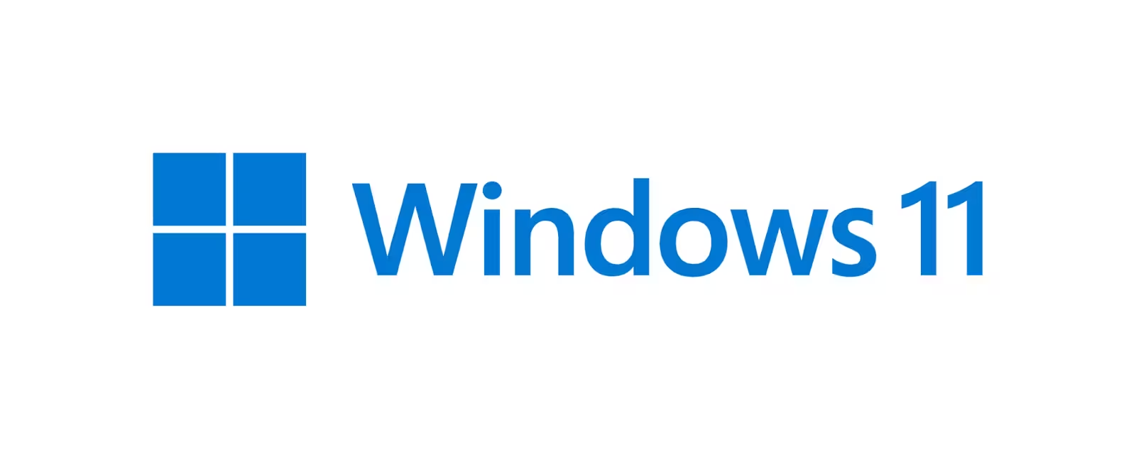
As we entered the 2020s, Microsoft was ready for yet another logo redesign—one that embraced modern design aesthetics while looking forward to the future. With the release of Windows 11 in 2021, Microsoft aimed for a fresh, polished look, not just for the operating system but for the logo itself. The focus was on creating a more refined and harmonious symbol that could represent both Microsoft’s legacy and its vision for the future of computing.
The Windows 11 logo took the minimalist approach even further. The iconic flag was now sleeker, with a more precise and geometric design. The four squares were now arranged in a perfect grid, symbolizing balance and structure. The colors were softer, and the overall aesthetic was cleaner and more sophisticated, in line with the latest design trends that emphasized simplicity without sacrificing elegance.
This new design was a nod to the evolving digital landscape, where simplicity, versatility, and adaptability were key. The Windows 11 logo not only represented the operating system’s updated features—such as a more user-friendly interface, improved multitasking, and better integration across devices—but also Microsoft's broader shift toward cloud computing and a more unified digital ecosystem.
The update also marked a departure from the more playful and bold elements of past logos, reflecting a maturity in Microsoft's brand identity. As the logo continued to evolve, it stayed true to its roots while embracing a fresh look that would resonate with modern users, reinforcing Microsoft’s place at the forefront of digital innovation.
Creating a logo that will become an iconic symbol of a global brand is no small feat. The Windows logo has gone through numerous iterations, each one representing a shift in the company’s vision and design trends of the time. But what goes into designing such a powerful visual identity? Let’s take a closer look at the creative process behind the Windows logo and the design decisions that have shaped it over the years.
Behind each redesign of the Windows logo, there was a team of talented designers working to translate Microsoft’s vision into a visual identity that could stand the test of time. The original 1985 logo, designed by the renowned designer Scott Baker, was simple and functional—intended to represent the new operating system’s basic window-like structure. However, as Microsoft’s ambitions grew, so did the complexity of the logo design.
When Microsoft adopted the flag design in 1992, the shift was driven by a desire to capture the dynamism and movement that the company was striving for at the time. Designers like David Gelb, who was responsible for the Windows XP logo, contributed to this change by embracing a more polished, refined aesthetic that mirrored the operating system’s increased stability and user-friendliness.
Designers who worked on the logo during the minimalist era of Windows 8 and 10, such as Julie Zhuo, focused on simplifying the brand's visual identity to reflect the increasing focus on digital experiences that transcended physical limitations. The transition to flat design and the shift toward a minimalist look was a direct result of user feedback and industry trends that emphasized clean, easy-to-navigate interfaces.
Every change to the Windows logo wasn’t just about aesthetics—it was a carefully planned move aligned with Microsoft’s branding strategy. The original logo’s four-paned window was symbolic of the operating system’s ability to organize and display information clearly and efficiently. As Microsoft evolved, the logo’s design was updated to reflect its increasing global influence and technological leadership.
For instance, the colorful flag design of the 1990s symbolized both the technological movement of the time and Microsoft’s expansion into consumer-friendly products. Meanwhile, the minimalist design of Windows 8 and 10 reflected the shift toward a more user-focused, digital-first world. Each iteration of the Windows logo tells a story of the company’s growth, the changing landscape of personal computing, and its ongoing commitment to innovation.
By continuously updating the logo, Microsoft ensured that it would remain relevant in a constantly changing world. Each redesign has been a step forward in building a brand identity that resonates with users across generations and technologies.
The Windows logo isn’t just a symbol on your desktop screen—it has permeated popular culture in ways that reflect Microsoft’s vast influence. From memes and internet culture to merchandise and media, the logo has become an enduring icon. It’s not only a part of technology history but has also found its way into pop culture, making appearances in unexpected places. Let’s take a look at how the Windows logo has been adapted and referenced beyond its official use.

In the age of social media and internet memes, even corporate logos have found new life in the world of memes. The Windows logo, with its clean lines and recognizable color palette, has been the subject of countless memes. From funny references to “blue screen of death” jokes to playful alterations that show what could have been, the logo has become a symbol of both nostalgia and humor.
One popular meme features the Windows error message alongside statements like “Keyboard has stopped working. Press any key to continue,” poking fun at the common frustrations users face. These memes are not only a way for users to express their relationship with the operating system, but also a way to create a shared cultural experience around the brand.
The Windows logo has also made its way into GIFs, stickers, and viral content, often being used for comedic effect or to represent outdated technology in a nostalgic way. This meme culture reflects the familiarity and recognition the logo has built over the decades, showing just how deeply embedded it is in global internet culture.
The Windows logo’s influence goes beyond memes—it has also become a symbol in the world of merchandise and media. From branded T-shirts and hats to tech accessories and laptop skins, the logo appears in countless products, often as a statement of digital culture. The logo has even appeared in pop culture references in movies, TV shows, and advertisements, symbolizing technology and innovation.
For example, in the early 2000s, Windows logos were featured prominently in movies depicting futuristic tech. Its association with progress and the digital age made it a perfect visual shorthand for technology-driven narratives. The logo has also appeared in documentaries and retrospectives about the rise of personal computing, cementing its place as a historic cultural marker.
Beyond the tech world, the Windows logo represents an entire generation’s relationship with computers. For many, it was the first logo they recognized as they learned to use personal computers, making it a symbol of childhood memories and learning experiences. Whether as a piece of memorabilia or a statement of belonging to the digital age, the Windows logo has become a part of the fabric of modern pop culture.
As technology continues to evolve, so too does the need for brand identities to adapt. The Windows logo has undergone numerous transformations, but what’s next? The future of the Windows logo is not just about visual aesthetics; it’s about how it will continue to represent Microsoft as the company embraces new technologies, trends, and user experiences.
Looking ahead, it's clear that the future of the Windows logo will continue to be influenced by global design trends and user expectations. As Microsoft shifts toward a more cloud-centric, AI-driven future, we can expect the logo to evolve to reflect these advancements. The growing importance of mobile-first and cross-platform experiences will likely drive further simplification, with even more focus on adaptability and ease of recognition across devices.
Additionally, as minimalism remains a dominant design trend, we could see further refinement of the logo’s geometric shape. With the emphasis on clean, simple, and scalable designs, the Windows logo may embrace even more subtle changes to maintain its relevance in an increasingly digital and interconnected world.
Many design experts and tech enthusiasts speculate that the next version of the Windows logo could embrace a more futuristic look, perhaps incorporating elements like dynamic motion or subtle animations. As the user experience becomes more immersive with augmented reality (AR) and virtual reality (VR), there may even be a shift towards a logo that reflects a more 3D or interactive design approach, aligning with the evolving tech landscape.
On the other hand, some believe that Microsoft will stick with the minimalist approach, as seen in Windows 11, ensuring that the logo remains timeless and versatile across all platforms, devices, and formats.
Regardless of the direction it takes, one thing is certain: the Windows logo will continue to be an essential part of Microsoft's identity. Its evolution will always be closely tied to the company’s innovations and vision for the future.
The Windows logo has had quite the journey, evolving from a simple window to the sleek, modern design we know today. Over the years, it’s adapted to reflect changes in technology, design trends, and Microsoft’s own growth. Whether you remember the vibrant colors of the '90s or the minimalist design of today, each iteration of the logo tells a story of progress and innovation, perfectly in tune with the ever-changing tech world.
As we look to the future, it’s exciting to think about how the Windows logo might continue to evolve. Will it embrace new design trends, or will it stay true to its minimalist roots? One thing’s for sure—it will always be a symbol of where Microsoft is heading. What’s your take on the Windows logo’s evolution?
The Windows 10 logo was created using a combination of physical and digital techniques. The logo was crafted by projecting the Windows logo onto a surface and photographing it, resulting in a unique and dynamic visual.
Using the Windows logo on merchandise without permission is generally considered trademark infringement. Legal experts advise that reproducing Microsoft's registered logo without authorization, especially for commercial purposes, can lead to legal consequences.
The LOGO.SYS file was used in Windows 95, 98, and Me to display a custom boot-up screen during startup. This file, located in the root directory, allowed users to personalize their system's boot experience.
To use the Windows logo to denote software compatibility, you must obtain a signed logo license agreement with Microsoft. This ensures that your product meets Microsoft's performance and compatibility standards.
The Windows key, often referred to as the "Win" key, is a keyboard button that opens the Start menu in Windows operating systems. Introduced in 1994, it serves as a shortcut for accessing various Windows features.


Discover how 500,000+ businesses and creators are using our AI logo maker in their Logo creation.


