The Evolution of the YouTube Logo: A Colorful Journey Through Time
How has the YouTube logo evolved? Discover the journey of YouTube's iconic logo design, from its humble beginnings to its sleek, modern look today.

How has the YouTube logo evolved? Discover the journey of YouTube's iconic logo design, from its humble beginnings to its sleek, modern look today.


YouTube isn't just a treasure trove of cat videos and viral dances; it's also a masterclass in branding evolution. The tale of the YouTube logo is more than just a design journey—it’s a reflection of the platform’s meteoric rise and its savvy adaptation to the ever-shifting digital landscape.
From its humble beginnings to its current iconic status, YouTube’s logo has seen more changes than the latest viral challenge.

Buckle up as we dive into the colorful history of the YouTube app logo. Discover how the original logo's classic red and white scheme paved the way for a sleek, modern design, and how each update has mirrored the platform’s growth. With interesting tidbits like how the red play button became as recognizable as the “skip ad” button, and fun facts about the logo’s evolution from a simple text to a symbol of video culture, you’re in for a visual treat that’s as dynamic as the content YouTube hosts. Let’s explore how the YouTube logo has transformed over the years, proving that even a logo can go viral!

Every great brand has its origins, and YouTube’s journey began with a logo that was as fresh as its concept. When YouTube launched in February 2005, its logo was a striking blend of bold red text on a crisp white backdrop—simple yet powerful, like the first note of a classic hit.
This section will unravel the story behind this inaugural design and how it set the stage for a visual identity that would soon undergo its first major transformation. From its initial burst of color to the first glimpse of its iconic play button, we'll explore how YouTube’s logo evolved to match the platform’s burgeoning influence and its growing role in digital culture.
Get ready as we take a nostalgic ride through YouTube's early days and its first steps into the limelight!
Imagine a time when YouTube was just a glimmer in the eye of its founders, Steve Chen, Chad Hurley, and Jawed Karim. In February 2005, they launched YouTube with a logo that was as straightforward as a classic black-and-white film. The original logo was a bold, red "YouTube" text sitting on a white background. It was like the logo equivalent of a vintage vinyl record—simple, timeless, and packed with potential.

This early logo was all about making a strong first impression. The red color popped, and the serif font gave a nod to traditional media, even though YouTube was anything but conventional. It was like the platform was saying, “We’re here to shake things up!”
Fast forward to 2006, and YouTube had its first major glow-up. After Google bought YouTube in November 2006, the logo got a much-needed refresh. The new design introduced a red play button—an iconic symbol practically a digital handshake for video content. The play button nestled into a red rectangle next to the “YouTube” text, giving it a slick, refined look.
It was like YouTube had traded its old jeans for a stylish new suit, signaling the world that it was ready to make waves in the digital ocean.
In the late 2000s, YouTube was ready to shed its early look and embrace a sleeker, more polished appearance. During this period, from 2008 to 2011, the logo underwent a transformation that mirrored the platform's growing maturity and its expanding role in the digital world. We’ll explore how these redesigns brought a fresh modern touch to the YouTube logo, integrating elements that highlighted its core focus on video content. With a refined play button and a streamlined font, this phase marked a significant step in YouTube’s branding journey. Join us as we dive into this era of design evolution, where the logo's updated look captured the essence of YouTube’s dynamic growth and its emerging influence in the online video revolution.
It was as if the logo had decided to leave its childhood look and embrace a more sophisticated style—like a high schooler trading in their sneakers for a sleek pair of dress shoes.
By 2008, YouTube was growing up and wanted its logo to reflect that. The red play button became more integrated into the text, and the font transitioned to a more modern sans-serif typeface. The 2008 design was all about clarity and impact. The play button became a focal point, emphasizing YouTube's core function: video. The logo was ready to face the world with confidence and a touch of modern flair.
It was like YouTube had gone through a refined grooming session, ensuring its brand looked impeccable across various screens and devices. By 2011, YouTube’s logo had another subtle makeover. The play button was slightly larger and more rounded, and the font was simplified further.

The 2011 logo was all about versatility and polish, making sure YouTube’s brand shone brightly whether you were watching a video on your computer or your phone.
As YouTube continued its meteoric rise, it was time for the logo to undergo a makeover that would reflect its expanding presence and evolving identity.
From 2013 to 2017, YouTube’s logo saw some of its most iconic redesigns. In this section, we’ll delve into the evolution of YouTube's visual brand during this dynamic period. We’ll explore how the logo’s design adapted to new trends, technology, and user expectations, ensuring it stayed relevant in a rapidly changing digital landscape. With fresh updates that balanced modernity with familiarity, these redesigns showcased YouTube’s commitment to innovation while honoring its roots.
So, let’s hit play on this chapter of YouTube's visual evolution and see how its logo became a staple in the ever-expanding world of online media!
It was like YouTube had swapped out its old script for a blockbuster movie font—bold, engaging, and ready for prime time.
2013 brought a major overhaul that made YouTube’s logo as iconic as a Hollywood blockbuster. The red play button was even more prominent, and the font was updated to give a fresh, modern vibe.

This redesign was a game-changer. The larger play button made it unmistakable that YouTube was all about video content. The new font and color scheme made sure the logo stood out in the crowded digital landscape.
In 2015, YouTube gave its logo a fine-tuning, like a musician perfecting their hit single. The play button was slightly adjusted, and the font was refined for better readability. This version of the logo was designed to be both eye-catching and functional—like a well-tailored suit that fits just right.
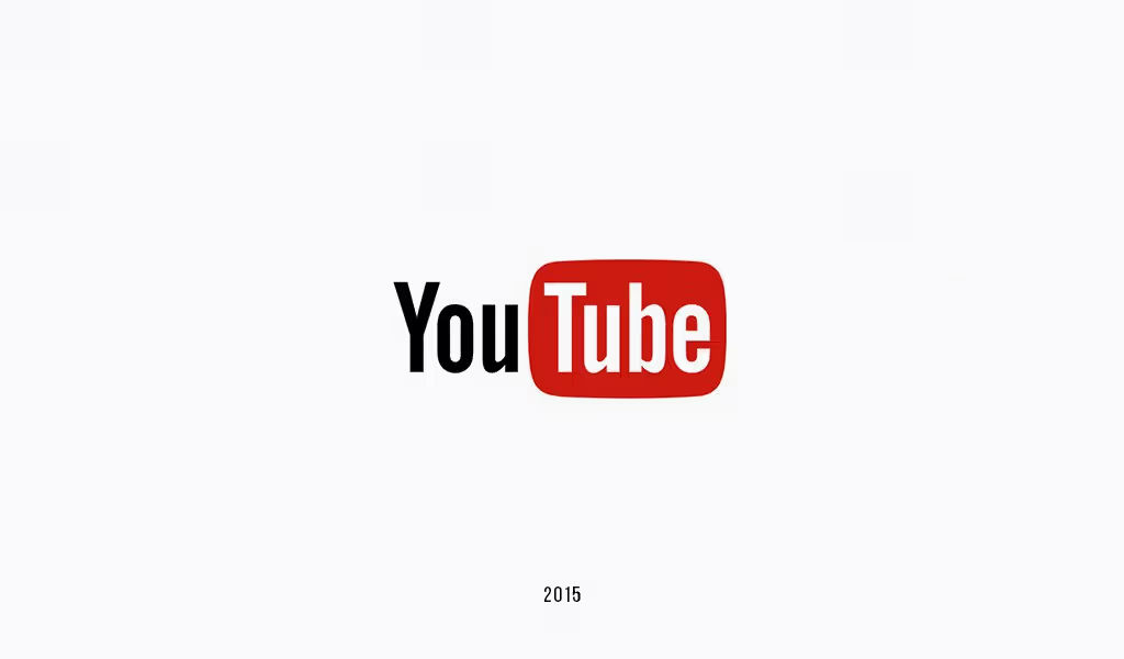
The 2015 update was all about maintaining a strong visual identity while ensuring the logo was adaptable to different media and formats.
"Simplicity is the ultimate sophistication." — Leonardo da Vinci

In 2017, YouTube took a page from da Vinci's book, embracing minimalist sophistication with its logo redesign. This era marked a shift towards a cleaner, more streamlined look that reflects the modern digital landscape. The new logo simplifies the design while maintaining the iconic red play button, focusing on a user-friendly experience and a stronger brand presence. Discover how this refined design captures the essence of YouTube's evolving role in the world of online video, blending elegance with practicality.
2017 was the year YouTube embraced minimalism with open arms. The logo got a major refresh with a focus on simplicity and modernity. The play button became a standalone icon, and the text was updated to a more streamlined font.
It was like YouTube had decided to go on a digital detox, stripping away the excess and focusing on pure, clean design.
This redesign was all about making sure the logo was instantly recognizable and adaptable across various platforms. The clean lines and minimalist design ensured that YouTube’s brand remained strong and effective in the digital age.
Since 2018, YouTube’s logo has maintained its minimalist charm with a red play button and a sleek wordmark. This version of the logo continues to emphasize clarity and adaptability, ensuring that it stands out whether you’re browsing on a smartphone or watching on a smart TV.
"Out with the old, in with the bold!" As YouTube has evolved from a niche video platform to a global media sensation, its logo has had a makeover almost as dynamic as the content it hosts. Each redesign isn’t just a change in color or font; it’s a visual reflection of YouTube’s expanding role and growing influence in the digital realm.
Let’s hit “play” on the evolution of YouTube’s logo and uncover how each update has shaped its brand identity. From the classic and clean beginnings to the sleek, modern looks of today, we’ll explore how these transformations mirror YouTube’s journey from a startup to a cultural icon. Dive in with us as we explore the impact of these logo changes and what they reveal about YouTube’s past, present, and future.
The evolution of the YouTube logo is like a visual history lesson on how the platform has grown and adapted. Each redesign has played a crucial role in building YouTube’s brand recognition. The play button, which was once a small detail, has become a powerful symbol of video content, cementing YouTube’s place as a leader in the digital world.
The journey of the YouTube app logo mirrors the main logo’s evolution. From its early days to its current minimalist design, the app icon has been updated to ensure it’s effective across various devices. The latest design is like a digital chameleon—adapting seamlessly to different screens while maintaining a strong brand presence.
The play button icon in YouTube’s logo is more than just a design element; it’s a universal symbol of video content. It’s like the VIP pass to the world of YouTube, instantly communicating the platform’s core function. The evolution of the play button reflects YouTube’s commitment to enhancing user experience and maintaining a modern, recognizable brand.

A Video that Made Waves: Did you know that the first video ever uploaded to YouTube was titled “Me at the zoo”? It’s a simple 18-second clip of co-founder Jawed Karim at the San Diego Zoo, but it’s a significant piece of internet history.
Logo Longevity: Despite numerous redesigns, the iconic red play button has remained a constant in YouTube’s logo. It’s like the constant beat in a musical composition—providing rhythm and recognition.
Design Trends: YouTube’s logo evolution mirrors broader design trends. From bold, serif fonts to sleek, sans-serif typefaces, the logo’s changes reflect the shifting preferences in digital design.
The YouTube logo history is a vibrant tapestry of design evolution, reflecting the platform’s growth from a small startup to a global digital powerhouse. From its early red-and-white simplicity to its sleek, modern minimalism, the logo has adapted to the times while maintaining its core identity. The YouTube app logo history and the old YouTube logo are integral parts of this story, highlighting the platform’s journey through the digital age.
As YouTube continues to innovate and shape the future of online video, its logo will likely continue to evolve. Each redesign tells a story of adaptation and growth, ensuring that YouTube’s brand remains as dynamic and influential as the content it hosts. So the next time you see that red play button, remember—it’s not just a logo; it’s a symbol of an ever-evolving digital era.
The original YouTube logo, launched in 2005, featured a two-part design: "You" was rendered in bold black, while "Tube" was displayed in white on a red gradient rectangle with rounded corners.
The YouTube logo redesign, particularly the recent updates, was led by Bettig, who has been with Google for six years and with YouTube for the past three. Under his leadership, the team aimed to reflect YouTube’s expansion into various services with a more dynamic brand identity.
On February 1, 2021, YouTube introduced an addition to its logo: the letters "BHM." This change sparked curiosity and some confusion about its meaning and whether it would be a permanent feature, as major companies like YouTube rarely update their logos frequently.
YouTube’s logo has undergone several updates over the years. Initially, the logo included the full brand name. The significant change occurred in 2011 when the play button icon became a central feature. Subsequent refinements in 2013 adjusted the proportions of the play button and its background rectangle, marking a new phase in the logo's evolution.


Discover how 500,000+ businesses and creators are using our AI logo maker in their Logo creation.


